
Ian is an MMO streamer whose channel recently reached 200 subscribers. Noticing the growing engagement of his community, he realized it was time to upgrade the channel’s visual identity. Until then, he had created a simple, generic logo to mark this new phase, but felt it was time for something more polished and professional. Music has always been an essential hobby for Ian, while surfing is his go-to way to unwind — two key elements that would ultimately shape the direction of this project.
Graphic Design
Streaming
The Project
Analysis of the Previous Logo
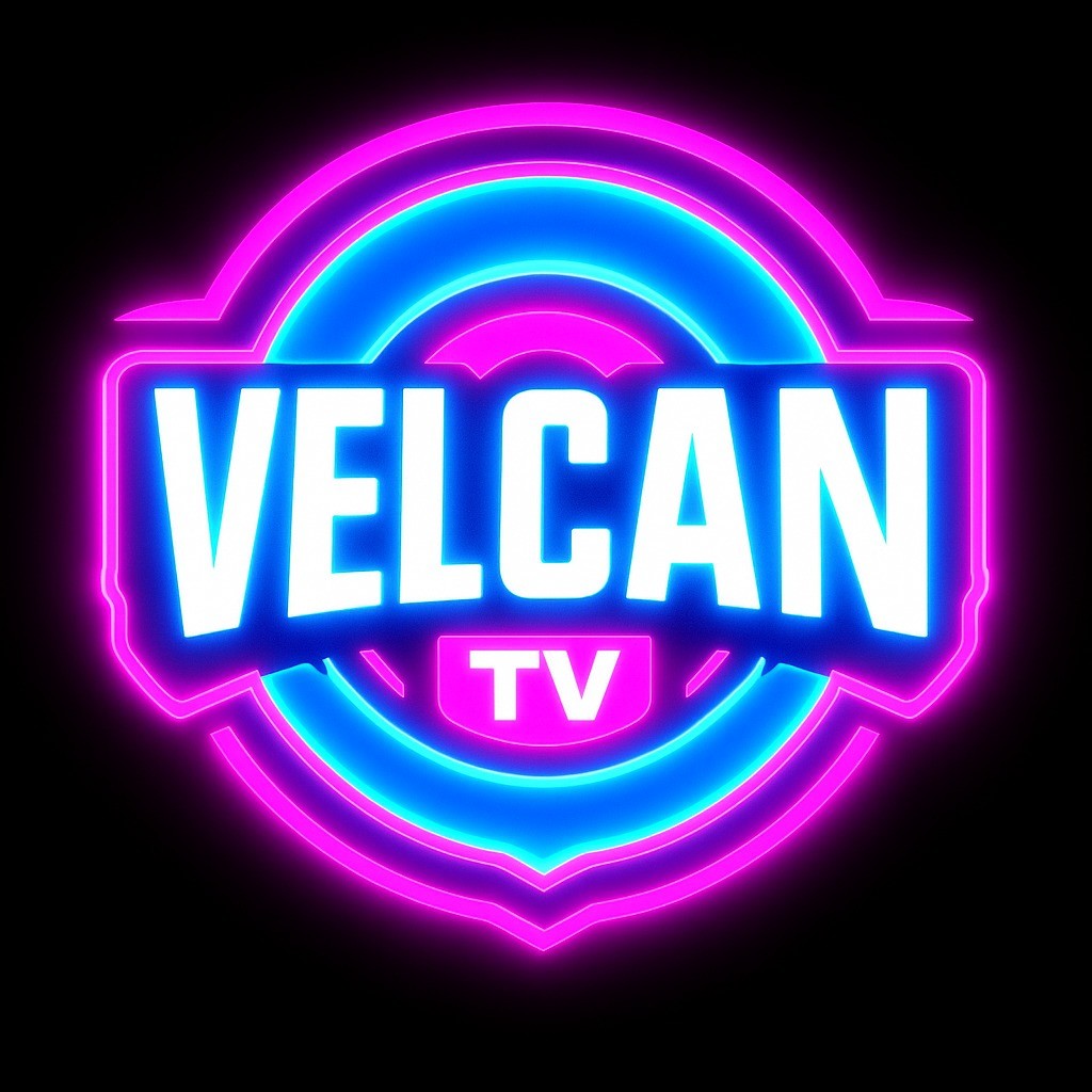
The previous logo featured circular elements, with pink and blue working together to create a neon glow reminiscent of classic arcade signage. While the colors did successfully channel the energy and brightness often associated with gaming culture, the overall composition felt quite generic. It lacked the distinctive personality and depth needed to truly represent the channel’s identity, leaning instead on a broad “gamer” aesthetic that could easily be mistaken for countless other brands.
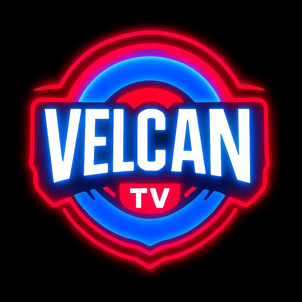
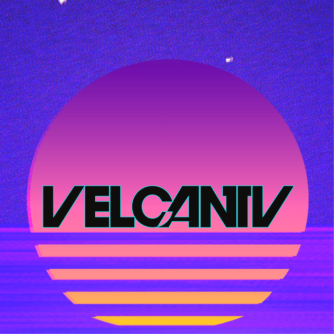
During our discussions, the client revealed an interesting backstory: the “TV” in VelcanTV was never part of an intentional branding choice. It was added simply because the name “Velcan” was already taken. This detail highlighted how the original visual identity had grown in a somewhat improvised way, without a clear narrative or creative direction — an opportunity for the rebrand to deliver a more purposeful and cohesive identity.
Design Solutions
Sketch & Research
When sketching initial logo possibilities, my mind gravitated toward television channels from the late ’70s to early ’90s. During research, I recalled my own experiences watching local broadcast stations while on vacation in small coastal towns. This personal connection became a key creative thread: the relaxed, seaside charm of regional TV channels could serve as a subtle but meaningful nod within the brand.
This link to the beach felt especially fitting, given how City Pop aesthetics often feature coastal imagery on album covers — sunlit mornings, pastel skies, and the calm allure of oceanfront life. That sense of freshness and relaxation resonated perfectly with the brand’s promise and the client’s request for a warm, inviting identity.
My strongest inspiration came from the typography used in the InterTV logo (formerly TV Alto Litoral), a station from Cabo Frio in the interior of Rio de Janeiro. Its bold, geometric yet approachable letterforms offered exactly the kind of retro authenticity and visual personality that could bridge the gap between nostalgia and the modern streaming landscape.
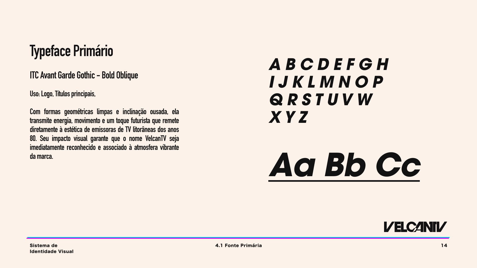
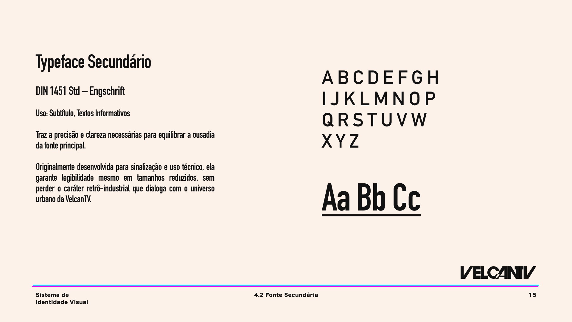
Typeface
Finally, for Japanese characters, I selected Hiragino Kaku Gothic Std in W8. This sans-serif typeface, with its straight strokes and balanced proportions, is widely used for Hiragana, Katakana, and Kanji, and is regarded as a high-legibility standard in both digital and print contexts. Its clean structure and bold W8 weight ensure a strong visual presence, especially in titles and graphic elements inspired by Japanese urban signage — a key influence in VelcanTV’s vaporwave and city pop aesthetic.
All type sizes and usage guidelines are detailed in the VelcanTV Guidebook, ensuring consistency across every format and medium.
Hi-Fi
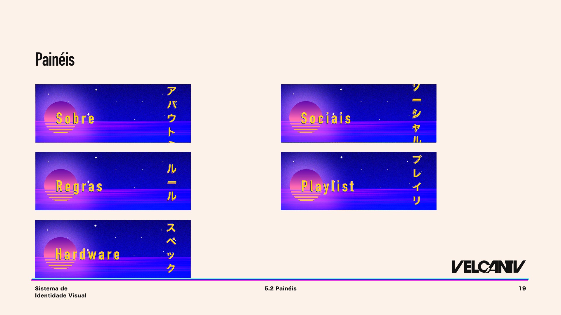
For the panels, I decided to maintain visual continuity with the “Live Starting Soon” banner, keeping a consistent setting but applying subtle refinements: the sun no longer carried the channel’s logo, blur effects were adjusted for a softer focus, and the presentation layout was streamlined. Each panel featured its theme in both Portuguese and Japanese, designed in a neon-inspired typographic composition to suggest motion and energy. The Japanese text was not purely decorative — it was a deliberate nod to the glowing kanji signs of Tokyo’s cityscapes, a core visual motif in vaporwave and city pop culture.
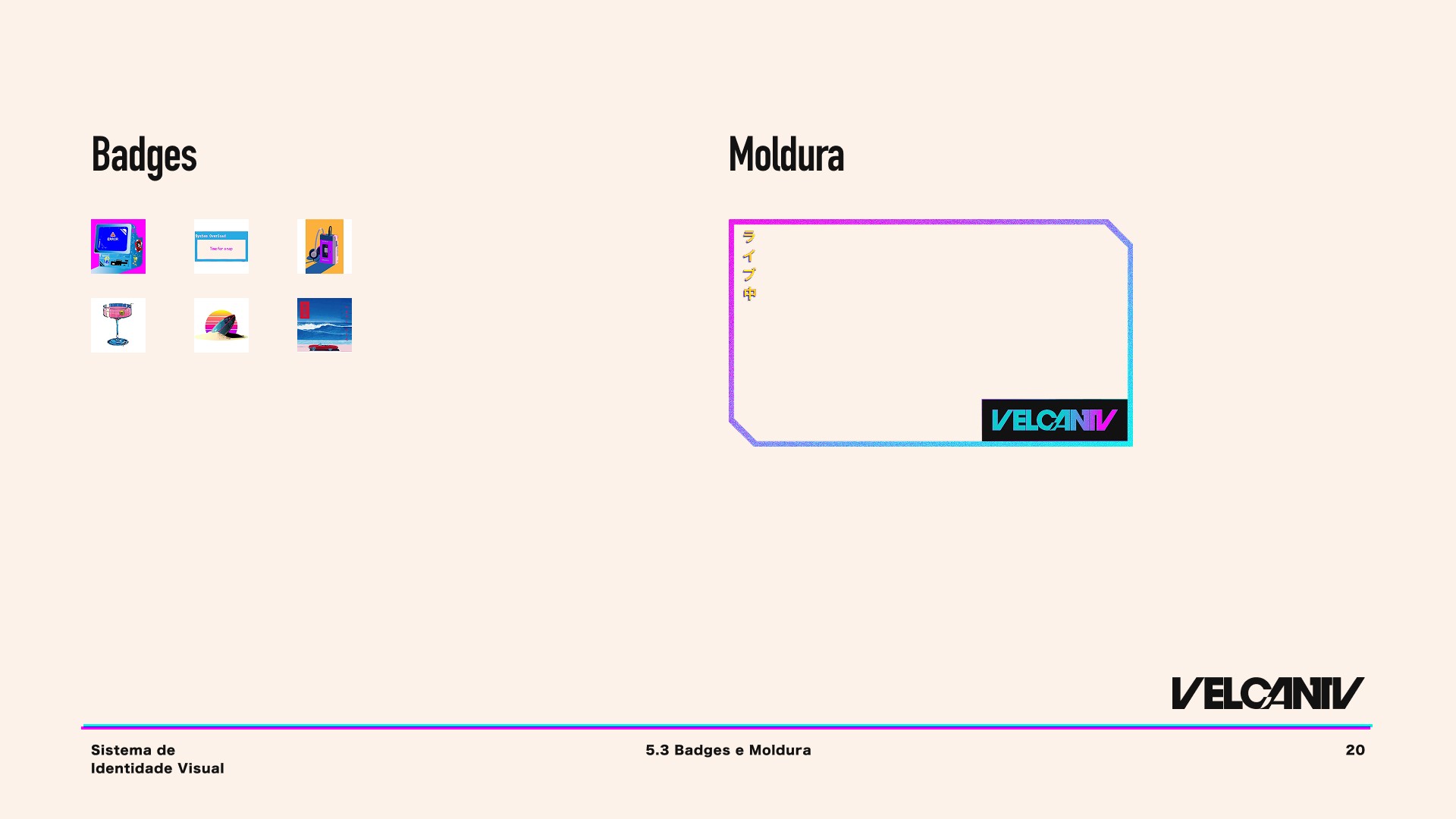
Subscriber badges became miniature snapshots of the client’s lifestyle: from the “New Subscriber” computer icon, to mid-journey milestones like naps, music, drinks, and surfing, culminating in the “One Year” badge — a peaceful beach scene representing the ultimate reward for loyalty and time spent in the VelcanTV community.
Final details
The last stage of the project was dedicated to fine-tuning — those subtle, deliberate adjustments that elevate the brand. This meant calibrating the neon glow intensity to avoid visual fatigue, refining color transitions to ensure smooth gradients across both print and digital formats, and testing type hierarchy for consistent readability in varying resolutions.
Small texture overlays, inspired by analog TV static and vintage print patterns, were applied to add depth and authenticity to the visuals without overpowering the core design. Japanese text elements were carefully kerned and positioned to balance aesthetic appeal with functional clarity, ensuring they read naturally to native audiences while still enhancing the retro-futuristic mood for non-Japanese viewers.
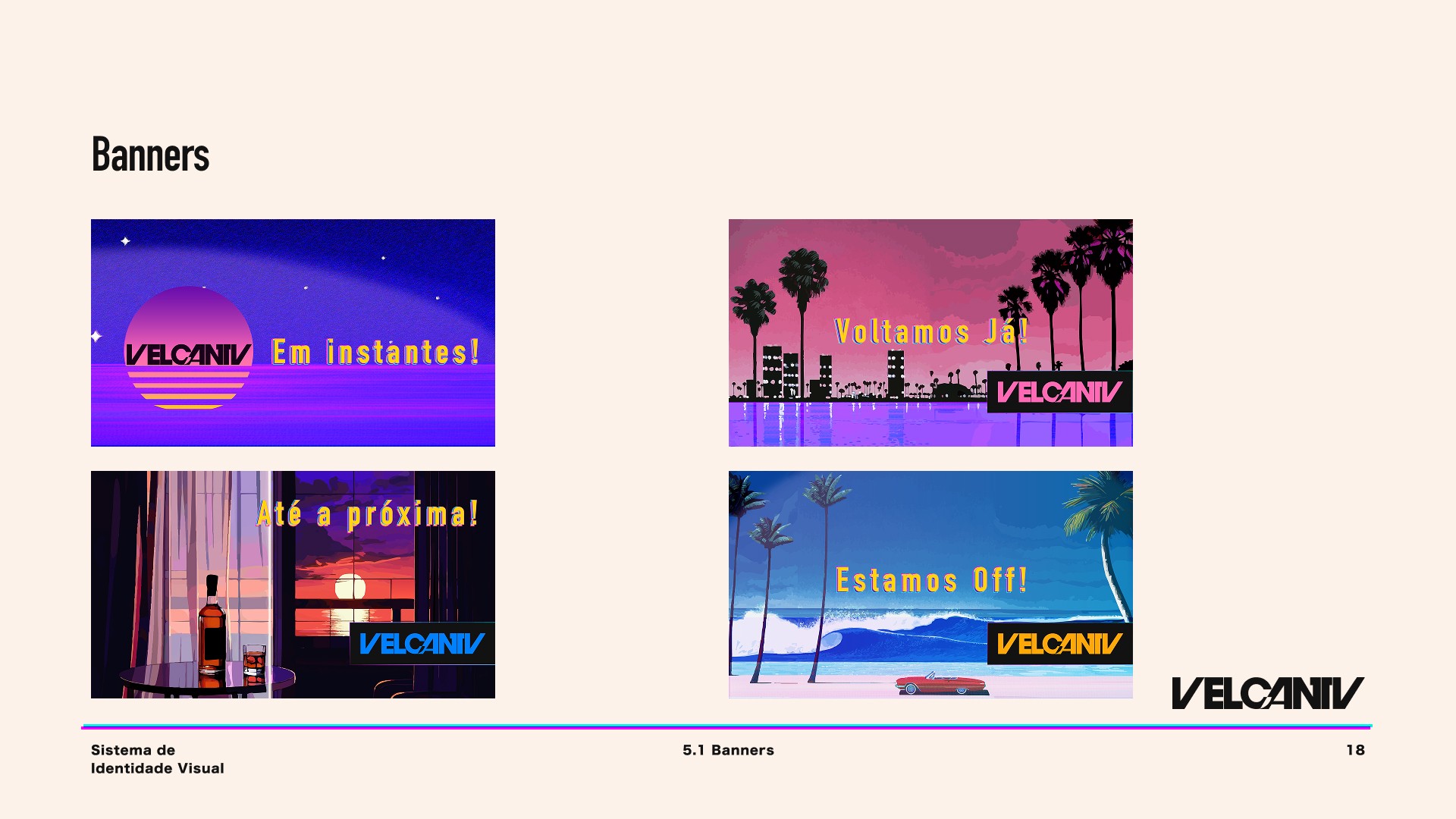
The final delivery included not only the logo, panels, banners, and subscriber badges, but also a comprehensive brand guideline presented as a nostalgic TV magazine. This extra layer of storytelling gave the client a brand identity that wasn’t just functional, but also emotionally resonant — an identity that speaks to the warmth, charm, and timelessness of the VelcanTV experience.
Next Steps:
The next steps for the project will focus on expanding VelcanTV’s visual identity into tangible merchandise, such as T-shirts, tote bags, mugs, and other collectible items. The goal is to translate the brand’s cozy-yet-urban retro atmosphere into products that the community can wear and display with pride, reinforcing their connection to the channel.
Limited edition seasonal designs for merch drops — Each collection will draw inspiration from VelcanTV’s nostalgic yet vibrant aesthetic, with thematic variations such as summer nights on a neon coastline, city pop-inspired festival graphics, or retro gaming marathons under glowing arcade lights. These designs will be time-limited, creating a sense of exclusivity and anticipation within the community, while also encouraging collectors to engage with the brand year-round.
Custom Twitch alerts and evolving badges — The next stage in strengthening community interaction will be the creation of dynamic on-stream elements. Alerts for subscriptions, raids, and donations will be animated in a style consistent with VelcanTV’s visual universe, blending vaporwave palettes with analog textures. Subscriber badges will evolve over time, visually representing a viewer’s journey — from a glowing pixelated emblem in the first month, to intricate designs echoing city skylines, vinyl records, or surf-inspired motifs for long-time supporters. This progression system will reward loyalty and keep engagement fresh.
This project was more than a visual redesign — it was an exercise in translating personality, lifestyle, and nostalgia into a cohesive and functional brand identity.
Thank you for your time and attention in exploring this case study. See you in the next project!