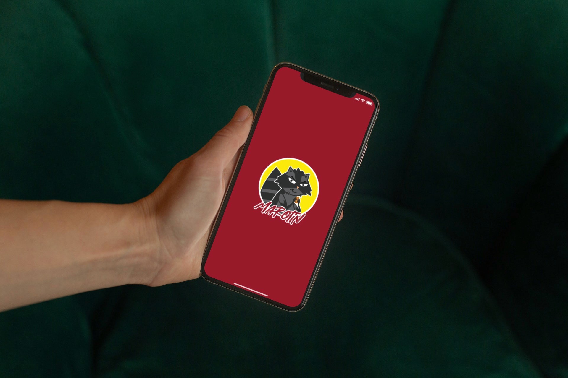


Marotin
Marotin
This project involved a revamp of the application's interface. Another designer reached out to me, proposing a collaboration on this design. He asked me to develop a user registration flow and to create and refine home screen and order screens. I promptly accepted the offer because the overall aesthetics and color scheme instantly captivated me.
This project involved a revamp of the application's interface. Another designer reached out to me, proposing a collaboration on this design. He asked me to develop a user registration flow and to create and refine home screen and order screens. I promptly accepted the offer because the overall aesthetics and color scheme instantly captivated me.
SERVICES
SERVICES
Ux / Ui Design
Ux / Ui Design
INDUSTRY
INDUSTRY
Delivery app
Delivery app
The Project
The Project
When I had access to the materials produced, I quickly noticed some contrast issues. Moreover, the interface was cumbersome to use, requiring more actions than necessary. I also realized that the app's communication opportunities were not being fully utilized, which is detrimental to both the user and the project. Additionally, some aesthetic details required refinement for a smoother look.
Furthermore, I was informed that the app's language needed to be more relaxed, with a touch of friendliness and playfulness toward the user. This was mainly due to the designed mascot. I was granted permission to use different secondary and tertiary colors, as well as to modify the project's aesthetics as I saw fit.
In this manner, I decided to kick off the project by reaching out to potential users for a quick survey to gather some insights.




Research
Research
I decided to commence with data collection and subsequent analysis. I took advantage of the information I had already received about the type of food that would be offered, as well as the target age group for the application (adolescents and young adults), and began to create a questionnaire for the research.
I conducted a interview with 5 potential users, gathering data on how often they placed orders, their opinions on the visual design, suggestions for improving functionality, preferred language style, elements they felt were missing, and components they considered unnecessary.
The most frequent comments revolved around the layout of the homescreen, with complaints about how items were presented. One user's response was particularly pointed: "I didn't like having to press a button to see more options because it ended up closing the one I was already looking at."
The lack of a search option was also mentioned because this user typically orders food with specific ingredients due to dietary restrictions. This feedback led me to suggest the inclusion of a page dedicated to ingredients and nutritional information for each menu item, which was deferred to future stages by the other designer's request.
Lastly, a third response highlighted the need for a clear indication of the delivery location.
Competitive Analysis
Delivery apps like Uber Eats and Bolt Foods often use various shades of green in their designs. In Brazil, apps like iFood and Rappi make extensive use of the color red. The same trend was followed with Marotin, but with a darker tone (#981A2A). The colors are supported by color studies for a food-related business, so there's no need to change what was already defined.
What I did, however, was pay more attention to the existing yellow (#FCEA0D) in the logo. I decided to use it as the secondary color for notifications. White (#FFFFFF), in the end, was reserved for transition animations to the notification bar and the "Add to Cart" buttons. Animations for notifications weren't present in the original design that was presented to me. Therefore, I decided that it would be necessary to include them in this new design to help users better navigate the application.
Due to much of the aesthetic work already being defined, I proceeded to analyze the competitors to improve the app's structure. This analysis was somewhat straightforward because of the standardization of food delivery apps, which have a functional and widely successful structure. So, I decided to follow a similar structure, with options presented by the type of food. Since the application was developed with a snack bar in mind, there are no restaurant options, only categories for snacks, sweets, beverages or combos.


The New Design
MidFi
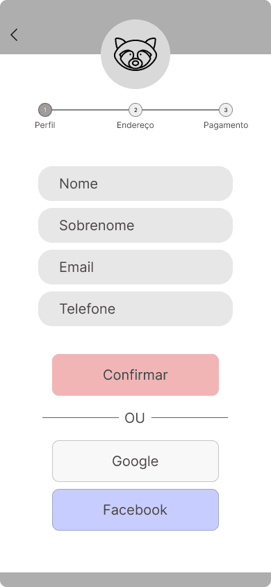
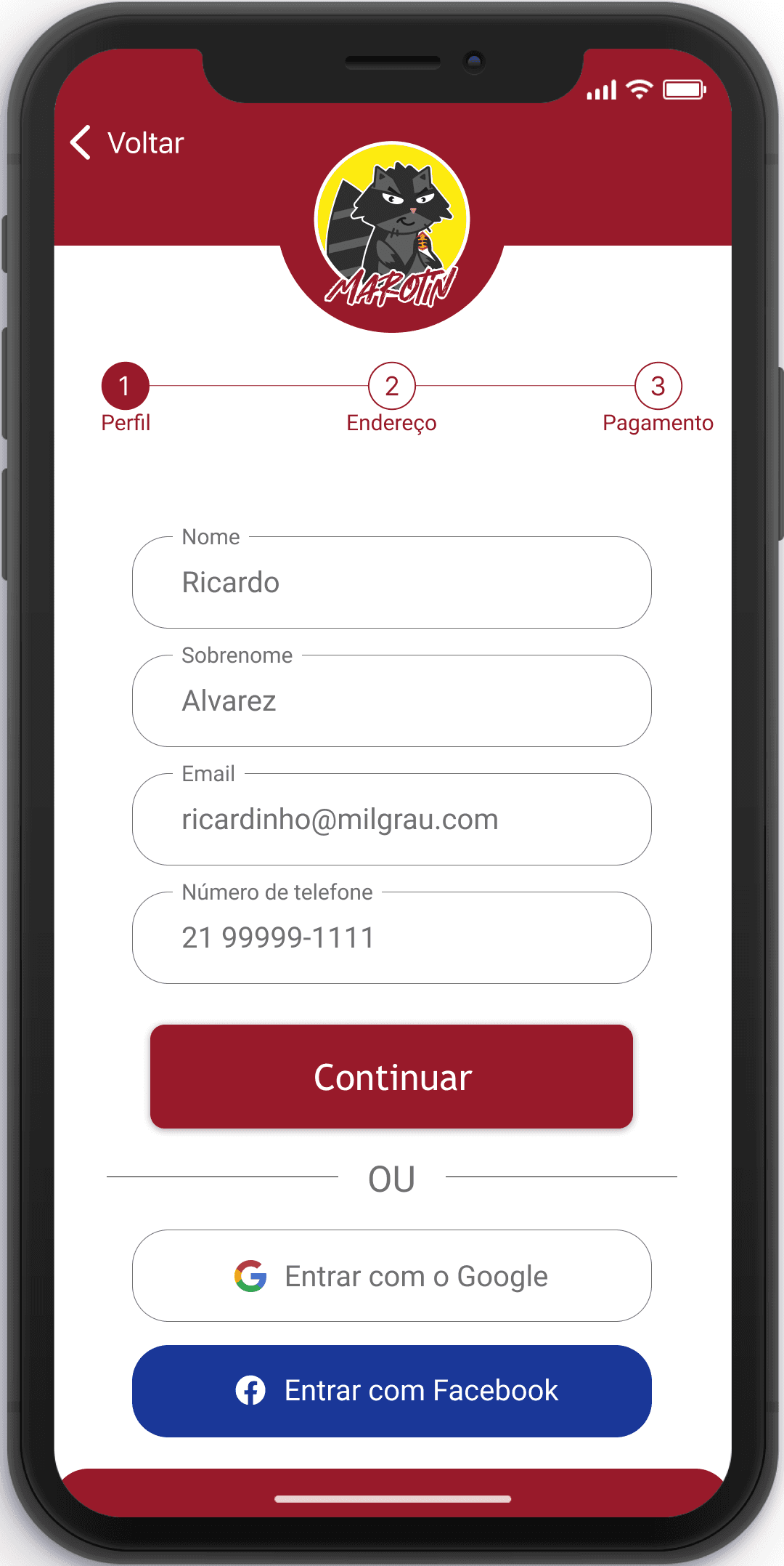
I started the development with the user registration flow. Since it's a registration screen, there isn't much to invent, and practicality is the main point here. I divided the process into three screens, providing enough space to avoid cluttering the layout and allowing registration via Google and Facebook.
The first screen was designed for entering profile information; the second focused on the address, while the third was for payment details.
Regarding the visual aspects, I opted to conduct a trial where the application logo, usually located in the bottom bar, would be repositioned to the top of the screen during the registration process.
The primary objective of this adjustment was to ensure the prominent visibility of the raccoon mascot. Additionally, I proposed a concept where informational tips about the app's functionality could be delivered as responses from the mascot, further enhancing the user experience. To validate this change, I meticulously executed A/B tests comparing the mascot's placement, scrutinizing its positioning at the bottom versus the top of the screen. The results clearly favored the placement of the mascot at the top of the screen, drawing greater attention and garnering positive feedback.
Simultaneously, I devised a pair of progress bars to convey the user's registration status effectively. Yet, I decided against subjecting both of them to testing, as one option distinctly outshone the other in terms of simplicity and user-friendliness. Consequently, the progress bar featured in this mid-fidelity design was deemed the superior choice.
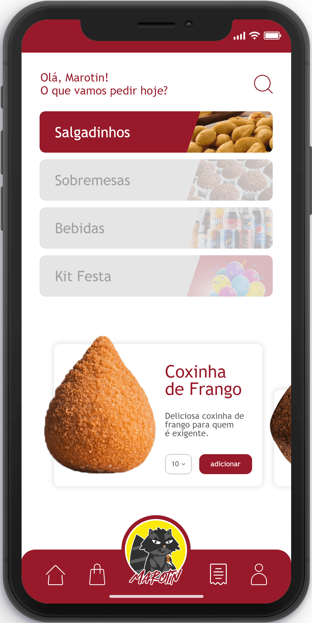
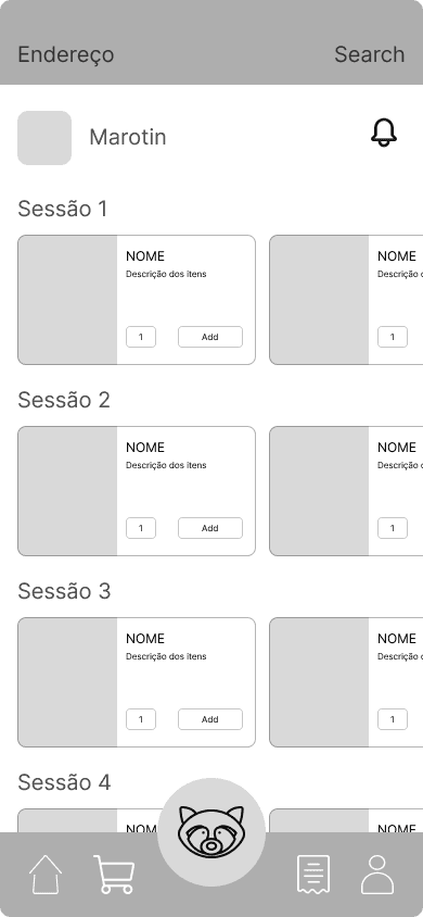
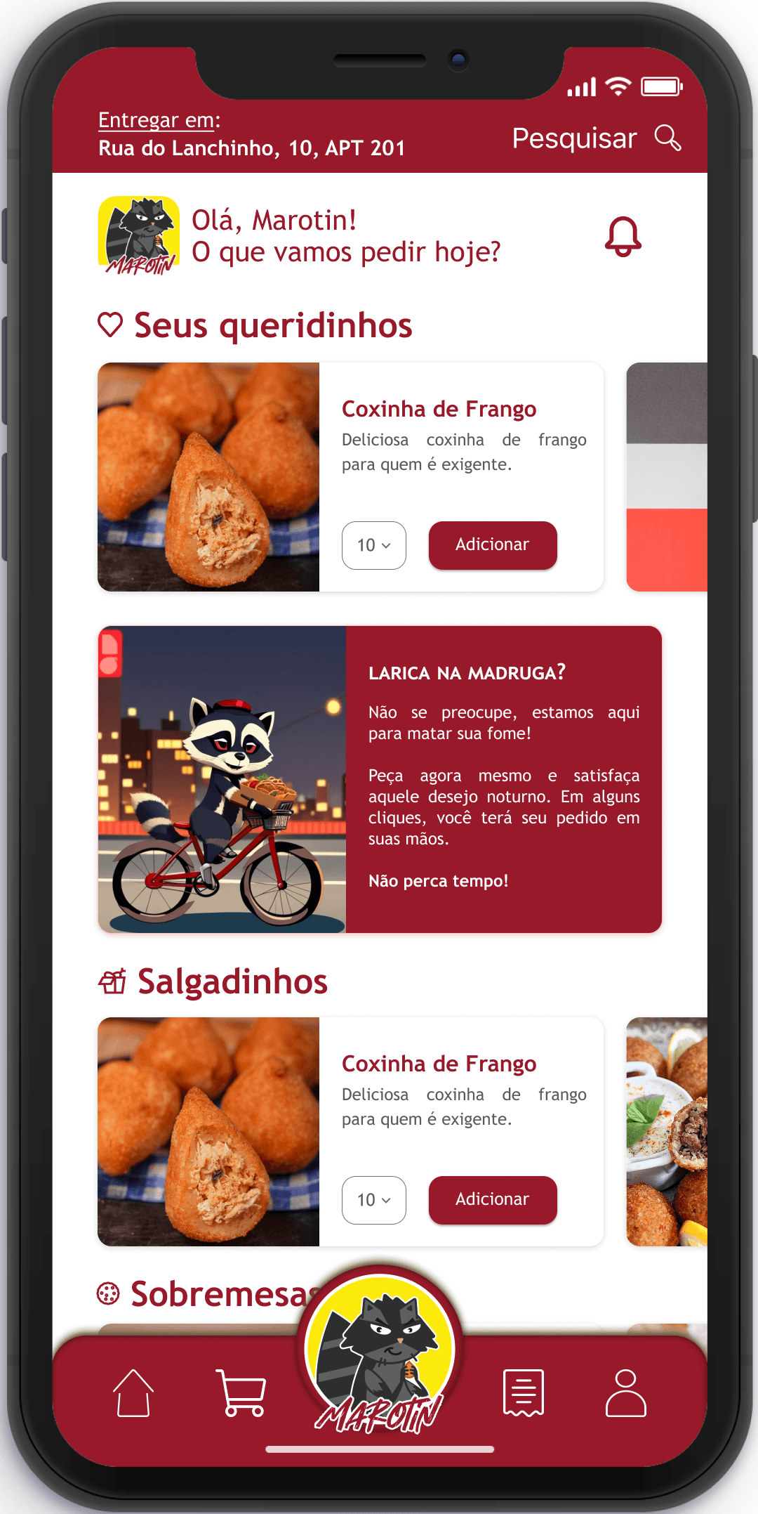
The homescreen was completely redesigned based on the data collected in the research. The model was based on the structures of other food delivery apps.
This way, rows of sections and their respective cards were developed, with an area for a short description, a dropdown to change the quantity, and an add button.
At the top of the screen, I developed an area to display the delivery address, as well as change it, and one for searching, to speed up the ordering process. A little below, I inserted a box for entering the Marotin and a text area, where the Mascot can leave messages and tips for the user. In the same row, a notification bell for sending promotions, informing the proximity of the delivery person, and other needs.
At the bottom of the screen, I made an adjustment to enhance user-friendliness and clarity. I replaced the icon of a bag, which was previously used to represent the shopping cart, with a more intuitive and explicit shopping cart icon. This change was motivated by the need for a clearer visual cue to help users instantly recognize the cart feature. The shopping cart icon is a universally understood symbol for managing one's orders, and it aligns with the standard conventions used in popular food delivery apps. This alteration is designed to make the user experience smoother and more intuitive, ensuring that users can effortlessly add items to their cart and navigate through the ordering process with ease. It's all about streamlining the interface and making the app even more user-friendly.


HiFi
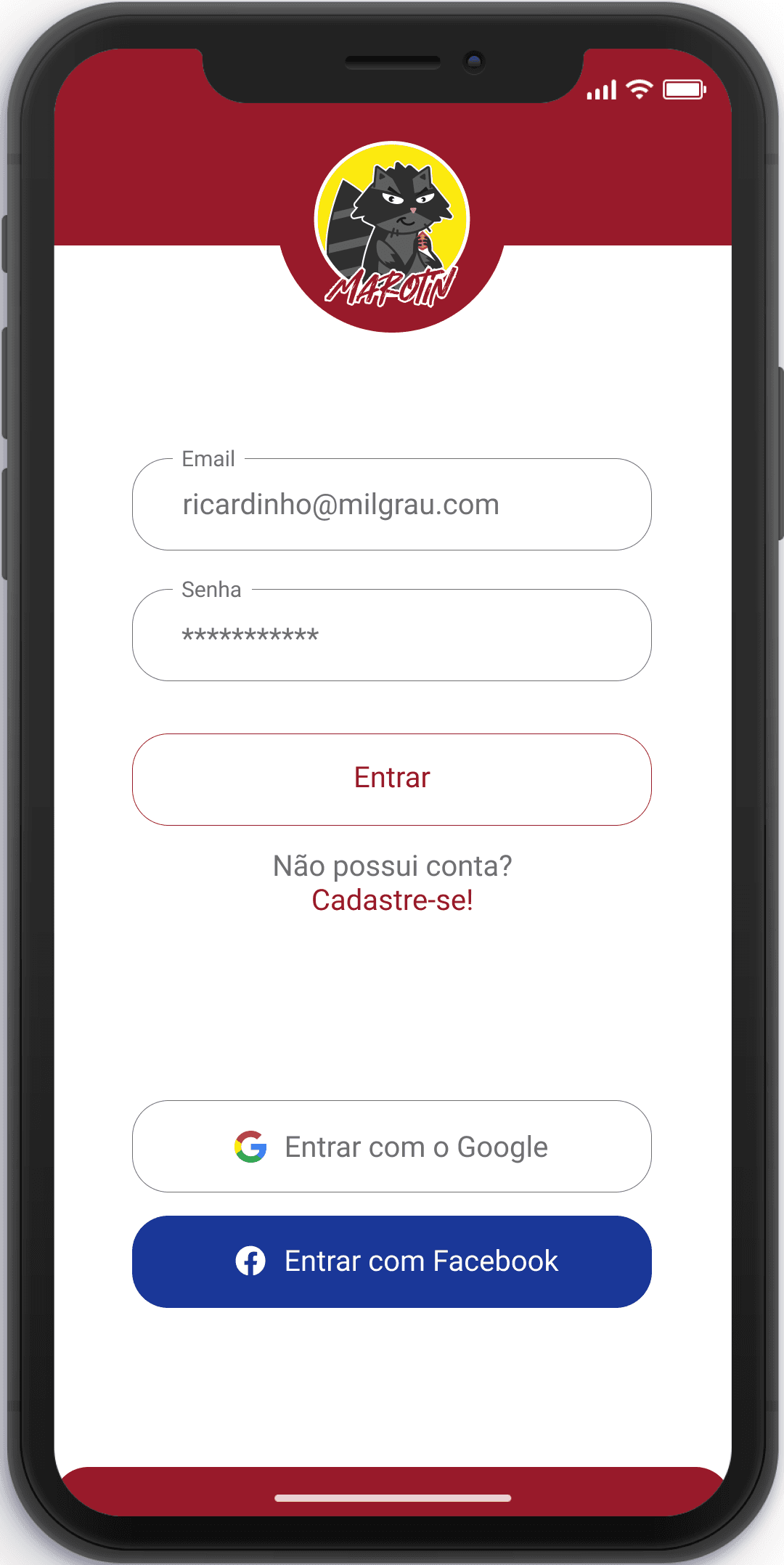
As a result, the Hi Fi stage of development proceeded without significant challenges within the user registration flow. Notably, the label positioning was thoughtfully placed in alignment with the input box to ensure a high level of clarity and user-friendliness. In the event of an error in the input information, a strategic design choice was implemented to change the color of both the box's border and the corresponding label to a vibrant red, effectively alerting users to any inaccuracies or issues.
As mentioned earlier, an approach to notifying the user of their progress within the registration process was implemented. A progress bar was added to the top of the screen, lighting up gradually as the user enters their data. In the event of an error or the need to modify any information, a back button was added to the upper part of the screen for added convenience and ease of navigation.



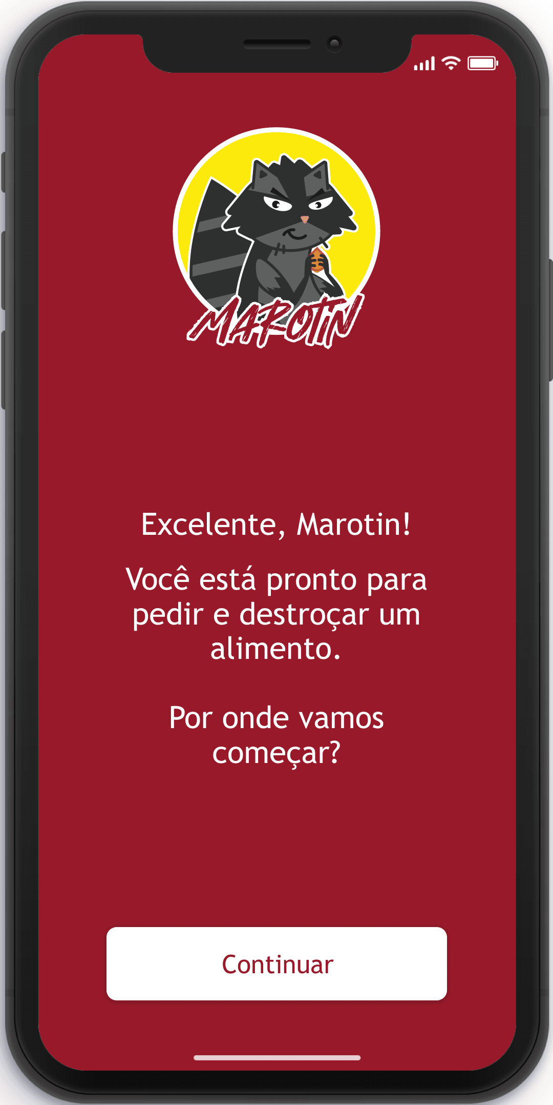


I made a deliberate addition, creating a dedicated screen to signal the user's successful completion of the registration process and readiness to start placing orders. In accordance with the desired tone, I elevated the prominence of the logo, ensuring the mascot took center stage. This design also embraced a more informal and friendly language, fostering a sense of the mascot as a supportive companion guiding users through their order selections.
The homescreen followed the mid-fi design pattern, but with minor adjustments. I introduced a new card to serve as a dedicated area for special messages, facilitating direct communication between the company and the customer. This space could encompass topics such as promotions or recommendations tailored to the user's preferences. Additionally, I took charge of creating the illustration within the card, and this task was executed with the assistance of Leonardo.AI.
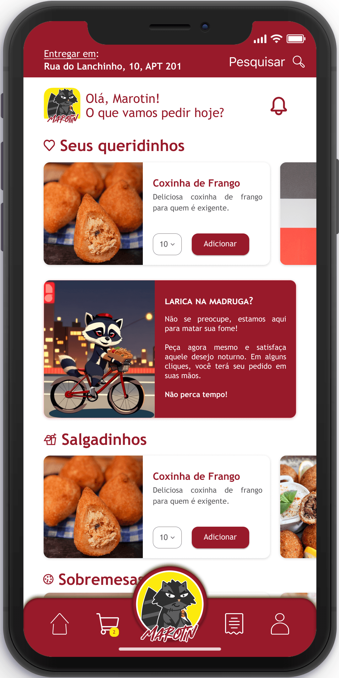
Furthermore, I modified the aesthetics of the logo on the app's toolbar. Previously completely flat, I added shading to give it a more 3D appearance and enhance its prominence. It's worth noting that I incorporated a subtle notification icon beside the shopping cart symbol. This feature serves to keep the user informed about the number of items added to the cart. During prototype testing, this addition was well-received and deemed as a valuable inclusion by the users.
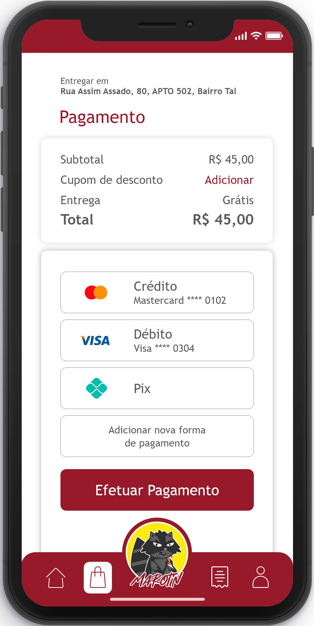
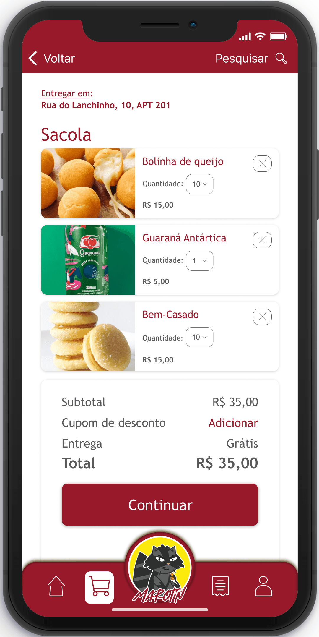
Some adjustments were made to the shopping cart page, including changes to the image style for options, shadows, and white space. These changes were implemented to improve the visual design and user experience of the cart page. Finally, I made some adjustments to the payment page. I began by changing the color and adding a line beneath the delivery information text to enhance visibility and create a sense of hierarchy within the information. I repositioned elements, improved the existing shadows (as the previous ones did not effectively convey a sense of lighting), and added text to clarify the payment options to the user. These changes aimed to make the payment process more user-friendly and visually appealing.






Next Steps:
For the upcoming phases, my recommendations include the creation of a dedicated screen that offers comprehensive details regarding the ingredients used in each menu option. Additionally, I advise the integration of a section facilitating the quick addition of side items. For instance, this section could suggest beverages after adding one or more food items.
Furthermore, it's essential to develop a user-friendly order history screen, considering that the relevant icon is already featured in the app's taskbar. To provide users with real-time information on their orders, I propose implementing a notification system to convey the specific order status. This could encompass distinct phases such as payment confirmation, order preparation, delivery in progress, and order completion. These additions will significantly enhance the user experience, making the app more informative and intuitive.
All rights reserved © Vinicius Scoralick 2023.
All rights reserved © Vinicius Scoralick 2023.
All rights reserved © Vinicius Scoralick 2023.