

Lizzie Favaro
Lizzie Favaro
Lizzie Favaro, a young Stylist in the Portuguese market, comes from a professional background in music production companies and fashion firms. Feeling the need for a website to showcase her work as a freelancer, she embarked on creating one herself with the aim of presenting her diverse projects. Seeking to elevate the aesthetic and functionality of her website, she enlisted my services to bring a more user-friendly and visually appealing design to her online portfolio.
Lizzie Favaro, a young Stylist in the Portuguese market, comes from a professional background in music production companies and fashion firms. Feeling the need for a website to showcase her work as a freelancer, she embarked on creating one herself with the aim of presenting her diverse projects. Seeking to elevate the aesthetic and functionality of her website, she enlisted my services to bring a more user-friendly and visually appealing design to her online portfolio.
SERVICES
SERVICES
Web Design
Web Design
INDUSTRY
INDUSTRY
Fashion
Fashion
The Project
The Project
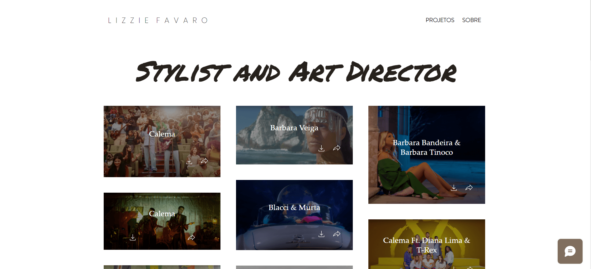
She initially developed something practical to showcase her work. However, she felt the need for something more aesthetic and reflective of her personality. This led her to seek my services to redesign her website and make it more user-friendly.
The client had made several requests: she wanted the site to improve user flow, be easy to use, and feature colors to her liking.
Her professional journey began with sewing, which was her first venture in the field. Later on, she started creating her own products and subsequently ventured into the footwear market. All this experience has endowed her with a keen aesthetic sense. Even while working in audiovisual projects, she continues to incorporate sewing projects into her stylings.
She initially developed something practical to showcase her work. However, she felt the need for something more aesthetic and reflective of her personality. This led her to seek my services to redesign her website and make it more user-friendly.
The client had made several requests: she wanted the site to improve user flow, be easy to use, and feature colors to her liking.


Her professional journey began with sewing, which was her first venture in the field. Later on, she started creating her own products and subsequently ventured into the footwear market. All this experience has endowed her with a keen aesthetic sense. Even while working in audiovisual projects, she continues to incorporate sewing projects into her stylings.




Being a portfolio for a stylist with a vast array of projects, several ideas emerged for presenting these projects.
There were the two main options:
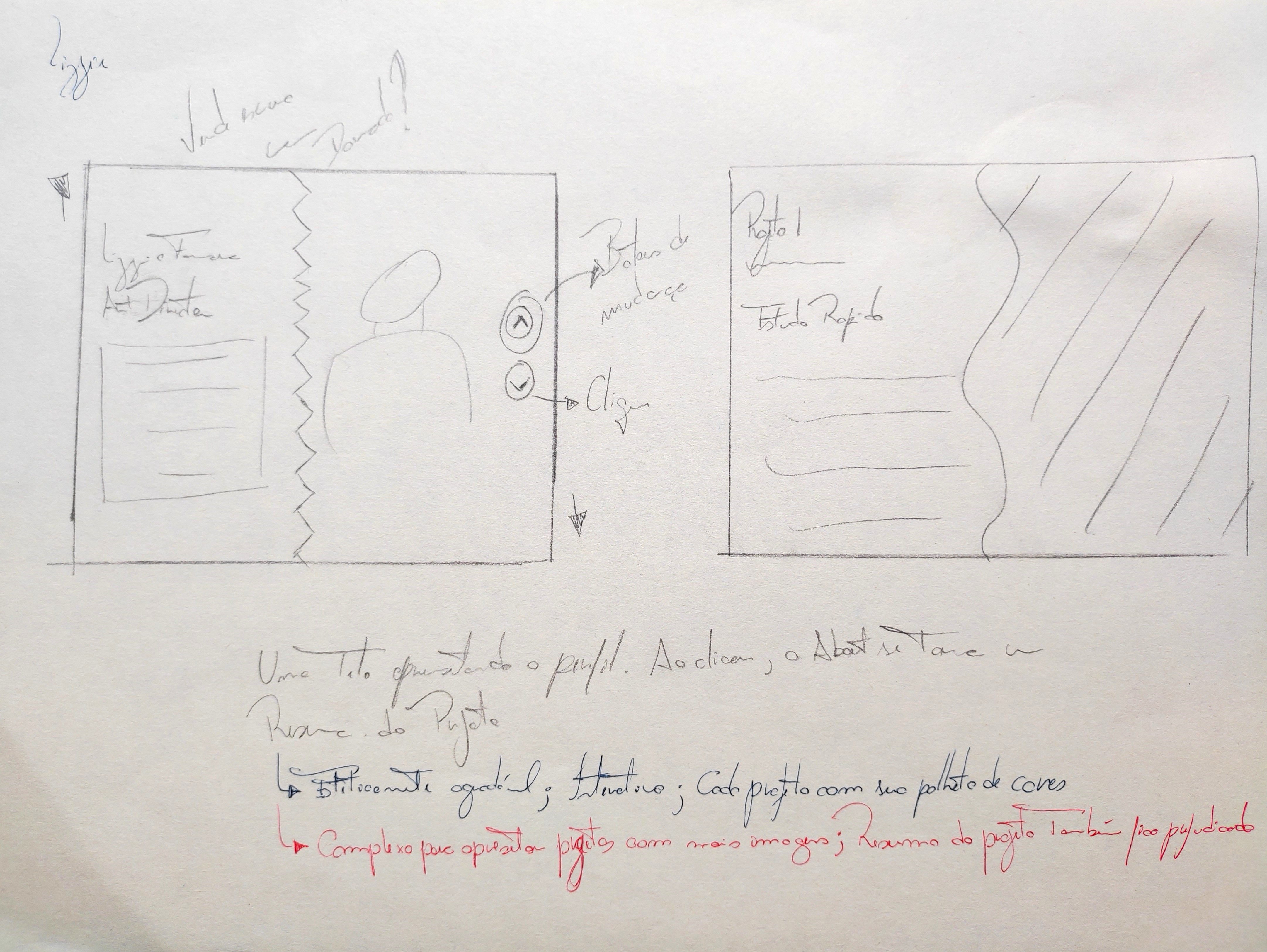
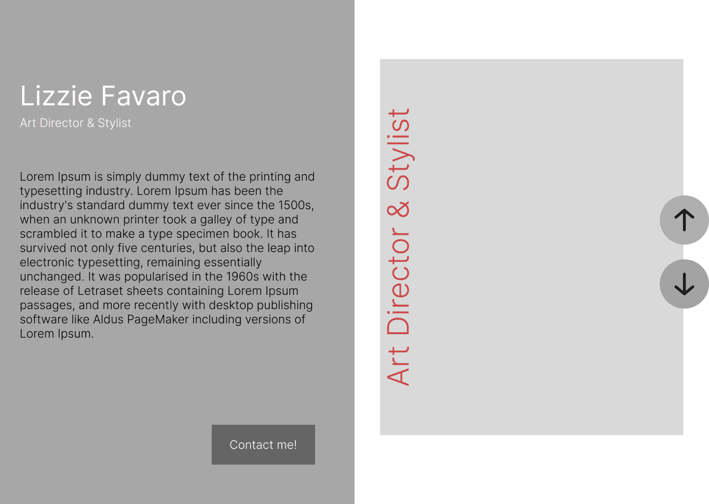
First, I sketched a more interactive page, split in half, where one side featured a carousel of images, while the other provided descriptions of the selected option. This choice was designed to be practical, meeting the client's preferences, while adding an aesthetic value and a certain level of interactivity. It aimed to present each project with its unique color palette derived from the photo shoots and videos of these very projects.
However, even with a scrolling effect, it might be more challenging for users to navigate through the extensive list of projects available.
I proceeded with this first project, developing quick mid-fidelity and high-fidelity designs to get a better visualization of the concept.
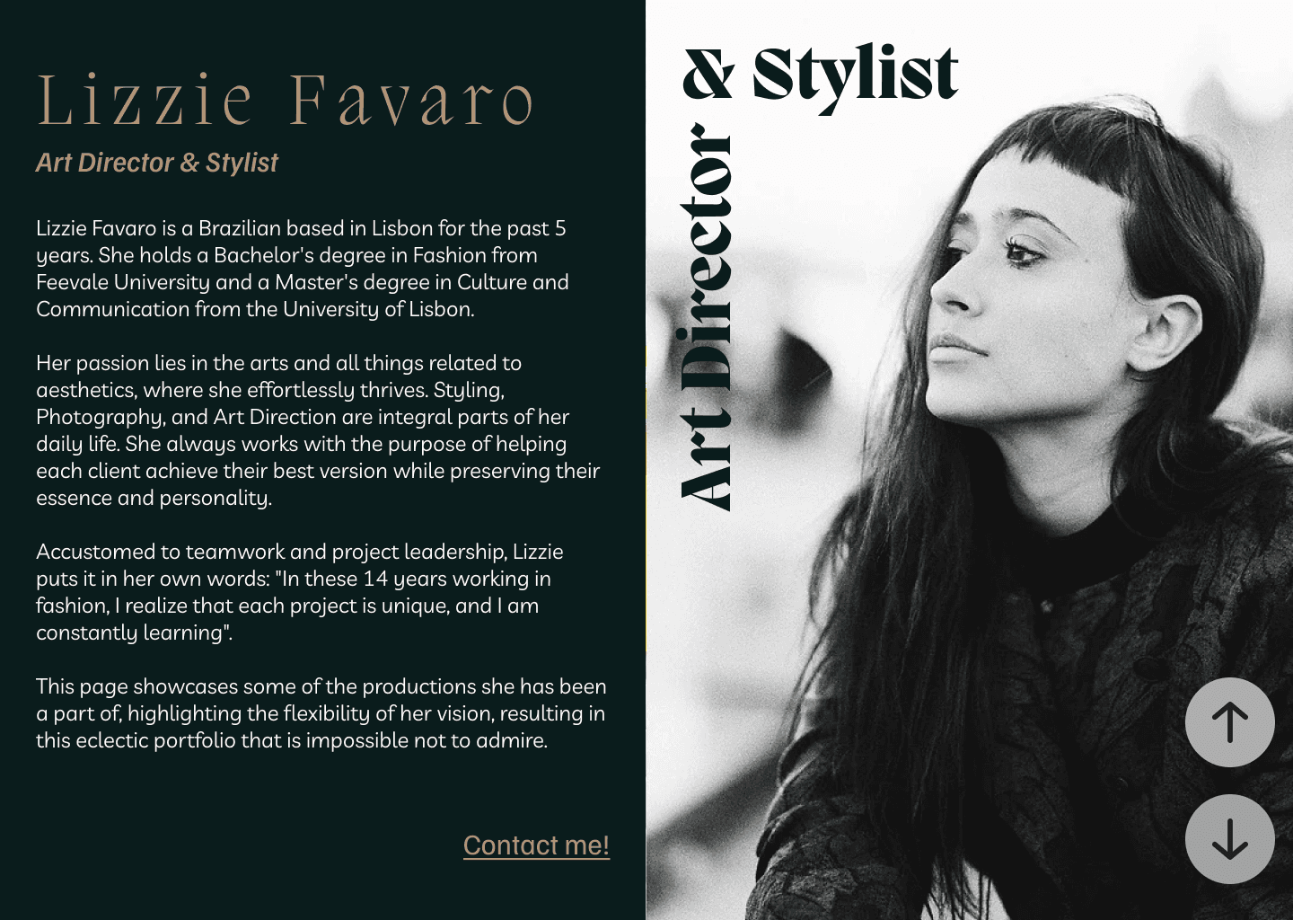


Even though it was an unrefined design, I already felt dissatisfied with the idea. However, I conducted some small research to provide me with greater confidence in the decisions to be made.
In this research, the interviewees liked the color changes for each project. However, the transition proved to be a bit tiring, and they soon stopped scrolling through the projects. The possibility of making contact also remained confined to the Stylist's section, which also became cumbersome as it required returning to her section.
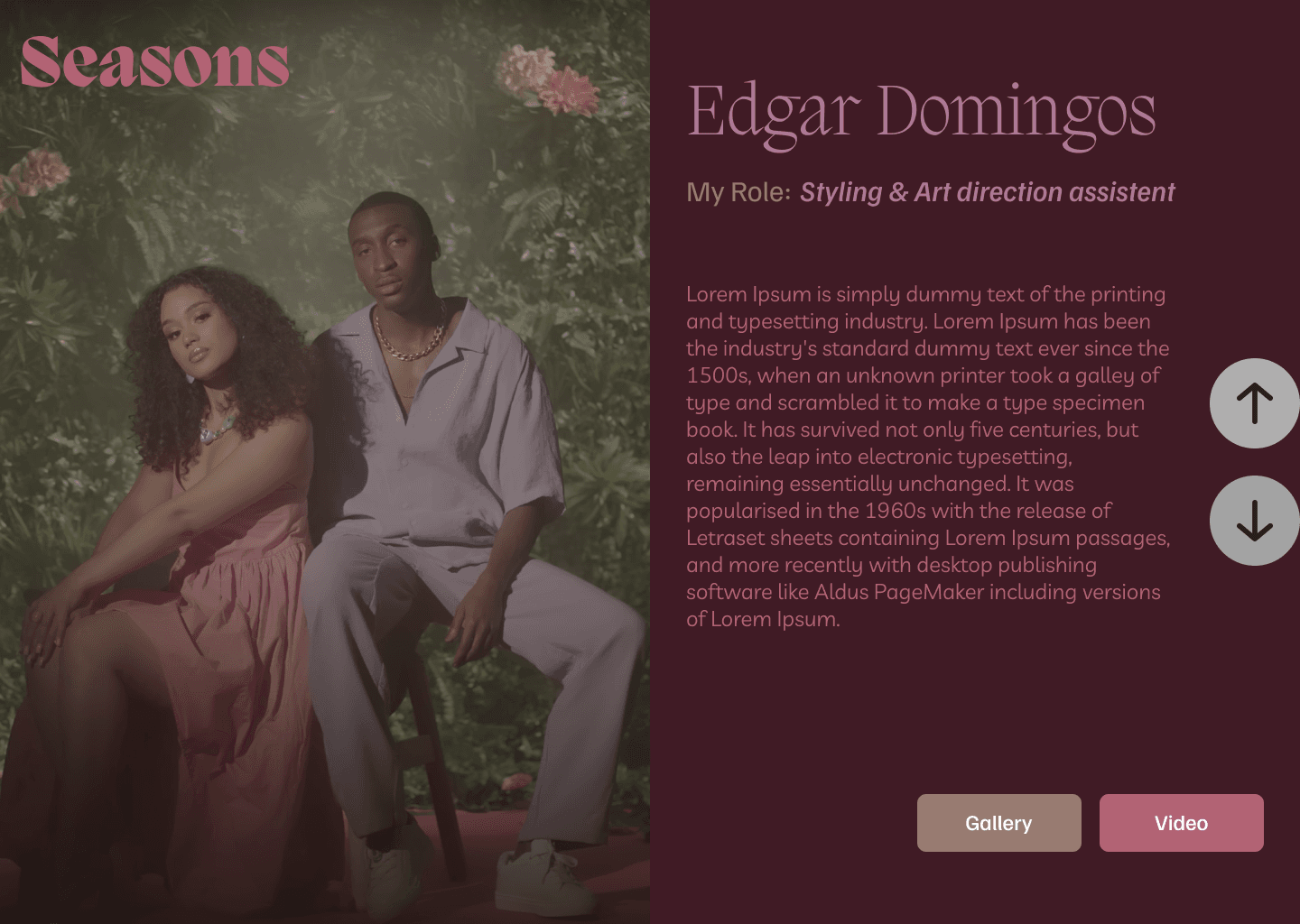
Another issue arose regarding the offering of photo options in the projects. During the tests, two options were presented: one with a carousel, where the images appeared smaller below the chosen image, and the other with a simple arrow to switch to the next image. Neither of these options was well received since the size of the projects made this clicking process somewhat tiresome.
The first draft revealed that the design wouldn't assist with the first and second requests, despite being perfect for the third. As a result, this idea was set aside, leading to the second sketch.


User & Ideation:
The idea behind the user flow is quite “simple”: we need users to be enticed to view the projects and, subsequently, contact the stylist.
The target users are artists and companies looking to enhance their aesthetic image. To gain a better understanding of how to develop something in this direction, I conducted a business analysis to identify core features in competitors.
What I noticed in the competition was a strong touch of personality on their pages, especially concerning the emphasis placed on the competitor's name. Thus, the second draft started from a point in that direction.
I realized that "I need to make her name stand out, as well as her functions."
The idea behind the user flow is quite “simple”: we need users to be enticed to view the projects and, subsequently, contact the stylist.
The target users are artists and companies looking to enhance their aesthetic image. To gain a better understanding of how to develop something in this direction, I conducted a business analysis to identify core features in competitors.
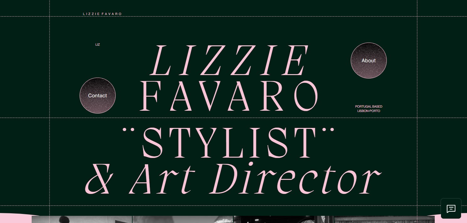
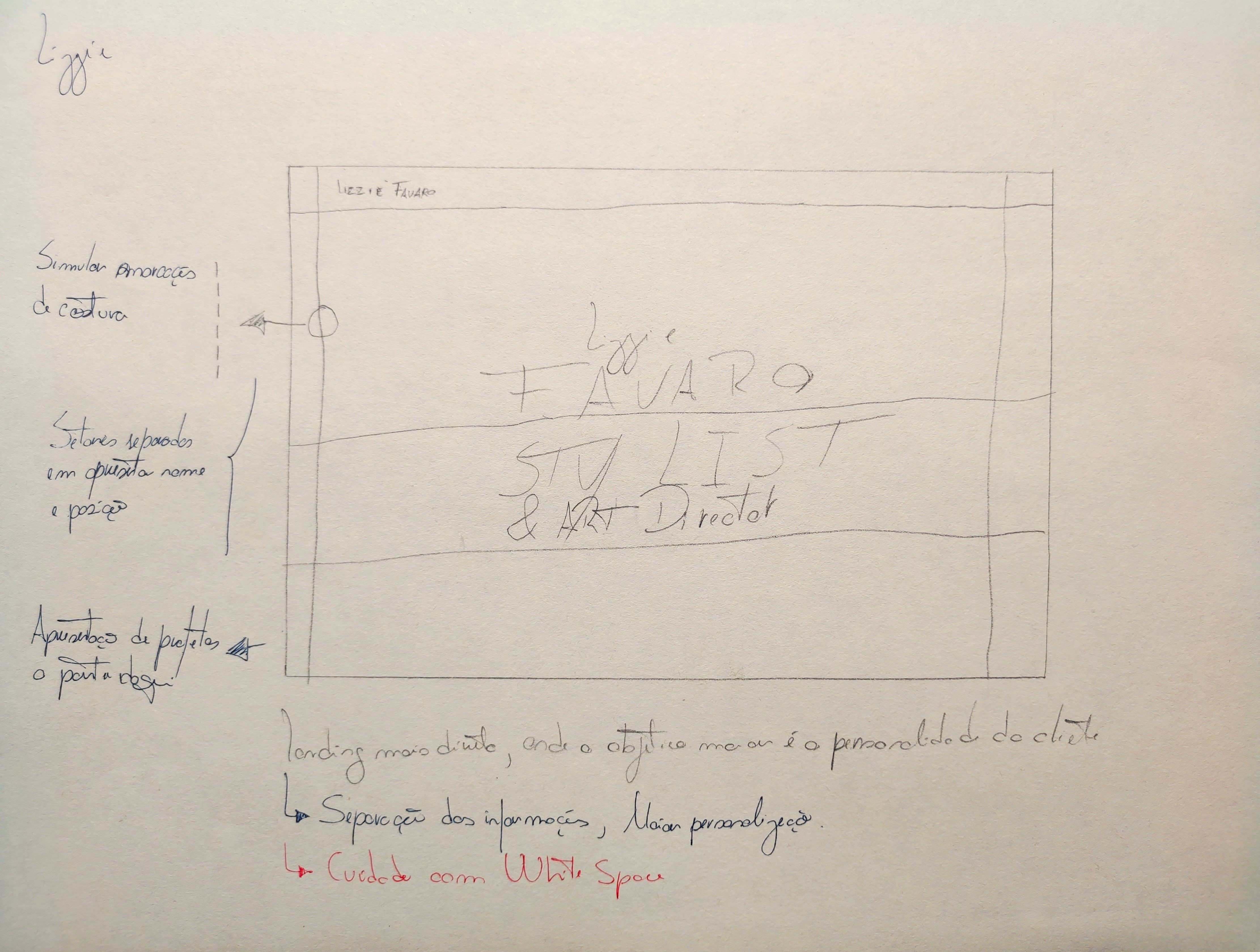
For the second sketch, I already had in mind that I should inject more personality into the project. Enlarging the name and function with a bigger font would create a situation where the white space needed to be filled more subtly. I decided to do a little braindump, looking for ideas that would resonate with the relevant profession and the stylist's background. For the development, I chose three keywords: subtle, elegant and hierarchy.
I determined that I would convert her homepage into a "pattern", a sewing project model. Such patterns are crucial for tailors and seamstresses during the creation of clothing, accessories, and other sewn items, as they provide instructions for cutting and assembling the pieces.
The objective here is to convey the immersion that all of the Stylist's work goes through her understanding and history in fashion and sewing. Furthermore, the patterns will assist me in utilizing white space effectively and establishing hierarchy within the project.
What I noticed in the competition was a strong touch of personality on their pages, especially concerning the emphasis placed on the competitor's name. Thus, the second draft started from a point in that direction.
I realized that "I need to make her name stand out, as well as her functions."For the second sketch, I already had in mind that I should inject more personality into the project. Enlarging the name and function with a bigger font would create a situation where the white space needed to be filled more subtly. I decided to do a little braindump, looking for ideas that would resonate with the relevant profession and the stylist's background. For the development, I chose three keywords: subtle, elegant and hierarchy.
I determined that I would convert her homepage into a "pattern", a sewing project model. Such patterns are crucial for tailors and seamstresses during the creation of clothing, accessories, and other sewn items, as they provide instructions for cutting and assembling the pieces.
The objective here is to convey the immersion that all of the Stylist's work goes through her understanding and history in fashion and sewing. Furthermore, the patterns will assist me in utilizing white space effectively and establishing hierarchy within the project.
The Second Design
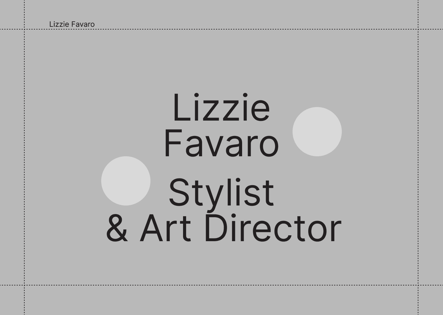
Throughout the development of this second design, you can see in the images that I initially considered separating the name and function in the draft but abandoned this idea when creating the LoFi.
Initially, I thought that a larger frame for these two elements, making them considerably more symmetrical, looked more pleasing to me.
However, I conducted an A/B test to determine what would work better for a user, and the result guided me to include another pattern between the stylist's name and her functions, with feedback such as "The separation makes her work stand out more".
One of the most enlightening comments from these quick surveys was, "Will the buttons be one in each section?".
Throughout the development of this second design, you can see in the images that I initially considered separating the name and function in the draft but abandoned this idea when creating the LoFi.
Initially, I thought that a larger frame for these two elements, making them considerably more symmetrical, looked more pleasing to me.


However, I conducted an A/B test to determine what would work better for a user, and the result guided me to include another pattern between the stylist's name and her functions, with feedback such as "The separation makes her work stand out more".
One of the most enlightening comments from these quick surveys was, "Will the buttons be one in each section?".
This made me wonder why the interviewee asked this. He mentioned that it was just a doubt and didn't elaborate further, but it left a mark on me. It made me rethink the placement of the contact and about buttons. Originally, I had considered placing one contact button and one about button for each section to achieve balance.
This made me wonder why the interviewee asked this. He mentioned that it was just a doubt and didn't elaborate further, but it left a mark on me. It made me rethink the placement of the contact and about buttons. Originally, I had considered placing one contact button and one about button for each section to achieve balance.


This question prompted me to leave both buttons next to the stylist's name. I took advantage of this situation to include two small pieces of text for aesthetic balance. I added her professional location, Lisbon, and a more friendly form of address, a nickname, Liz, to make the client feel closer and more approachable. Both texts are optically aligned with the buttons.
You might ask me: Why?
Because I wanted to keep the section with her name associated with all possible interactions with the stylist. So, next to her name, you have her nickname, location, about, and contact. Everything the client needs to know about the person Lizzie is gathered in one place. This is Lizzie. Meanwhile, her work has its dedicated space to receive the attention it deserves. This way, her work will stand out more. Just like the interviewee suggested.
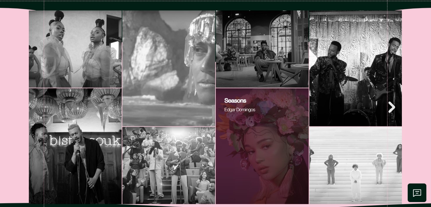
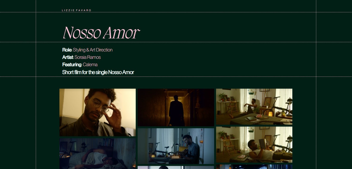
Meanwhile, the Patterns work on the stylist's project pages as natural dividers of sections, indicating the title in the first section, details in the second, and a mosaic of photographs of this work in the third.




Style Tyle:
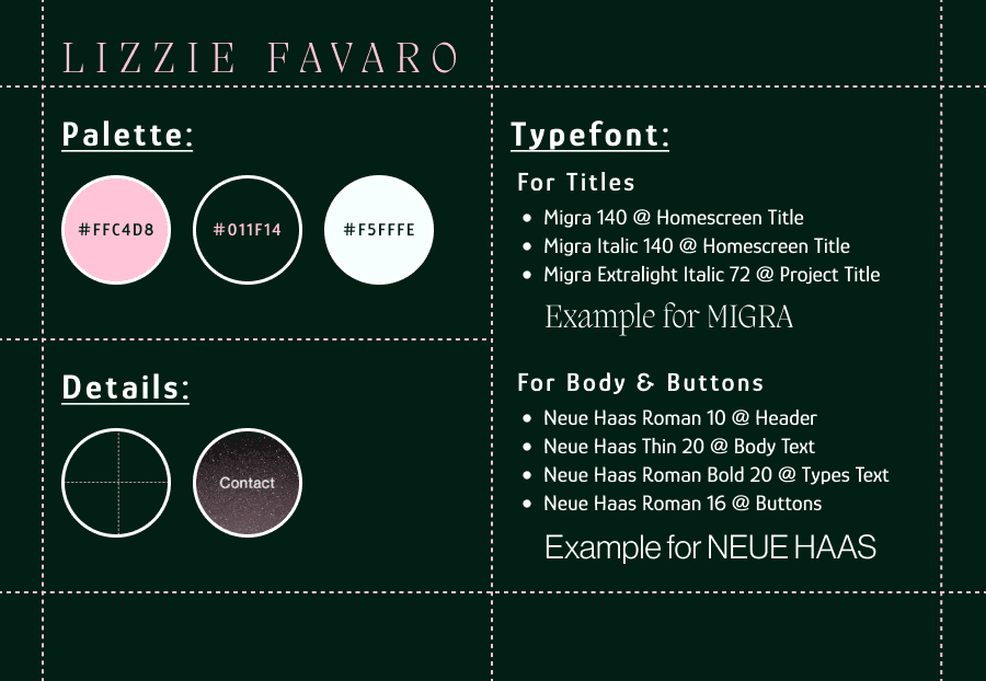
For the color scheme, there was already a request for the use of green. The search was for complementary colors in addition to the shade of green to be used. In the first design, I had worked with a dark gold color, which the client approved. However, with the development of this second design, I felt that the green needed something to provide more contrast.
In a conversation with the client, I suggested using pink to complement the design. She promptly agreed and even stated a preference for pink over gold. So, I began some tests to determine the best shade. The initial attempts were close to magenta; however, the contrast was too aggressive to the eyes. This led to attempts to find a pastel shade of pink, which ultimately resulted in the desired shade of pink (#FFC4D8).
Lastly, I wanted a third color for body text details. I wanted something that would be part of the fashion universe and would harmonize well with the pattern structure, like an accessory for an "outfit." I considered using gold again due to its association with jewelry in this context. I also thought about using gemstone colors, but this would make the design too busy and detract from the minimalism I was aiming for. However, there are jewels that don't have to be highly colorful: pearls. I began to explore shades of pearly white for a third color.
I conducted a quick A/B test between a pearly white with a slight greenish tint (#F5FFFE) and one closer to yellow (#EAE9C8). The results were considerably more positive for the first option, and it looked more pleasing against the green background.
Business Card:
Business Card:
Although it wasn't initially planned, I thought it would be interesting to include a Business Card in the package.
I decided to maintain the aesthetic of the Sewing Project model in order to create a consistent style that resonates with the website and aligns with the sewing theme, which is part of the client’s background.
I opted for a square format instead of the classic rectangular shape. This choice makes it easier to carry and adds a more "outside-the-box" feel, reflecting the client’s personality.
On the front side, her first and last name are displayed with inverted directions, playing with perspective. On the back, I chose to keep the email and phone number aligned in a straightforward direction to make contact information easy to read. Meanwhile, the website address and professional title follow the same style, arranged around a QR code that links to a Linktree page with the client’s professional platforms.
She initially developed something practical to showcase her work. However, she felt the need for something more aesthetic and reflective of her personality. This led her to seek my services to redesign her website and make it more user-friendly.
The client had made several requests: she wanted the site to improve user flow, be easy to use, and feature colors to her liking.

Her professional journey began with sewing, which was her first venture in the field. Later on, she started creating her own products and subsequently ventured into the footwear market. All this experience has endowed her with a keen aesthetic sense. Even while working in audiovisual projects, she continues to incorporate sewing projects into her stylings.
Next Steps:
For the next steps, I presented a website architecture proposal to Lizzie, including sections within the About page to address her previous work, such as photography projects, dress and tie sewing, footwear design research, and Bauhaus aesthetic movement research.
I also suggested the inclusion of a second language translation, allowing her work to be accessed and understood by more users.
These suggestions arise due to the short timeframe I had for the development and implementation of the current design in her portfolio. Once these new features are added, they will be included in this study.
All rights reserved © Vinicius Scoralick 2023.
All rights reserved © Vinicius Scoralick 2023.
All rights reserved © Vinicius Scoralick 2023.