Italiano Dove Vuoi
Italiano Dove Vuoi
This was a project for Ironhack.
Nadia is the owner of Italiano Dove Vuoi website. The name can be translated as “Italian wherever you want”.
The teacher recognizes that big teaching companies are her main competition. She knows some teachers in those networks have personal websites to sell their services, but she values her independence and teaching approach. Due to Italian tax rules, she can't sell materials directly. She experimented with online booking, but clients weren't thrilled with an external service. Still, she's open to giving it another shot.
SERVICES
SERVICES
Web Design
Web Design
INDUSTRY
INDUSTRY
Education
Education
The Project
The Project
Secundary Research & User Research
According to the the 2022 Duolingo Language Report , which presents the latest language trends and learner behavior in the App, with more than 500 million Duolingo learners, Italian is the 6th most studied language on the App. A considerable position, taking into account the number of users on the platform. The report says:
After two years of pandemic travel restrictions, people around the world were eager to take long-delayed vacations, but record flight cancellations, soaring travel costs, and high inflation led to mixed results. International travel rose sharply in 2022, though not quite reaching 2019 levels, and data from new Duolingo learners reveals something similar: Travel as the primary motivation for learning a language began to rise in some countries, but it lags behind 2019 (and even 2020) levels.
Still, global online language learning market is predicted to move a massive amount between 2022 and 2031, close to $32 billion. The ease of online teaching, 1 to 1 or in classes, and hybrid strongly contributes to this.
With the survey carried out, we conclude that our target users are adults who need to learn this second language due to work or travel, and may also be interested in cultural factors.
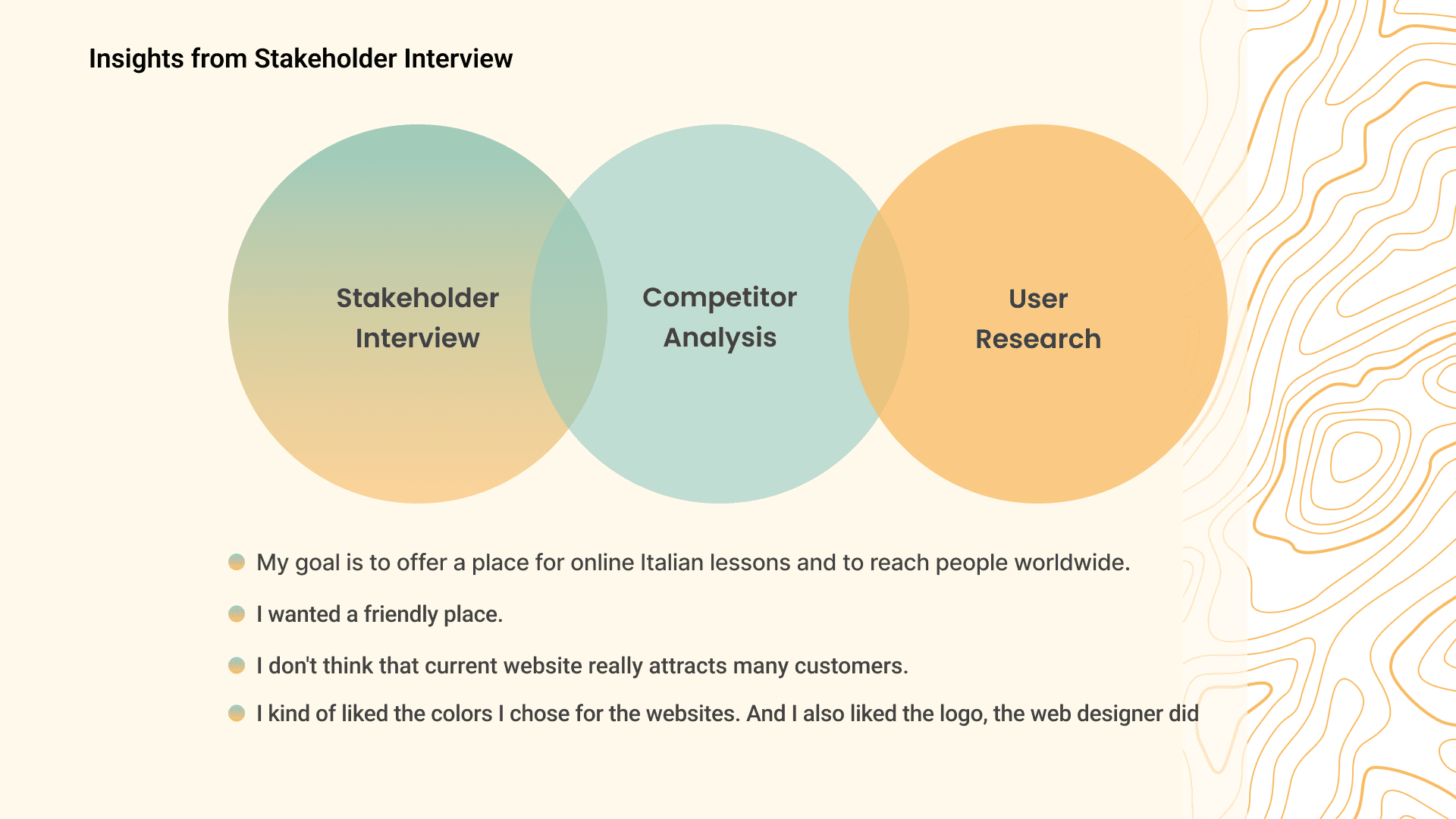
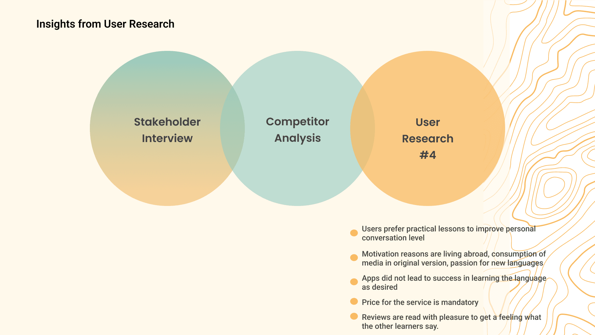
Interviews
In our user research, users showed that trust in the quality of service is the main point when looking for a language teacher. Good recommendations are a must for them to contact this service provider.
“I think I would need to feel confident that they’ve been around for a while. That they could somehow prove that they had the reputation”
Besides that, the aesthetic issue was also present as a guarantee of trust. Some respondents understand that the appearance of the site demonstrates that the professional cares and is up to date with trends. In addition, they understand that a good appearance on the site is related to more direct and less crowded texts.
“Minimalist, simple and really pleasant aesthetics. Sometimes I think 'Do I really have to read this all?'”
Define
Define
Affinity Diagram
We’ve split our Affinity Diagram into 3 clusters, with their own built-in categories. These Clusters were: Motivation, Notable Attributes and Course Types. Categories such as confidence and aesthetics entered the Notable Attributes cluster.
We’ve split our Affinity Diagram into 3 clusters, with their own built-in categories. These Clusters were: Motivation, Notable Attributes and Course Types. Categories such as confidence and aesthetics entered the Notable Attributes cluster.
We’ve split our Affinity Diagram into 3 clusters, with their own built-in categories. These Clusters were: Motivation, Notable Attributes and Course Types. Categories such as confidence and aesthetics entered the Notable Attributes cluster.
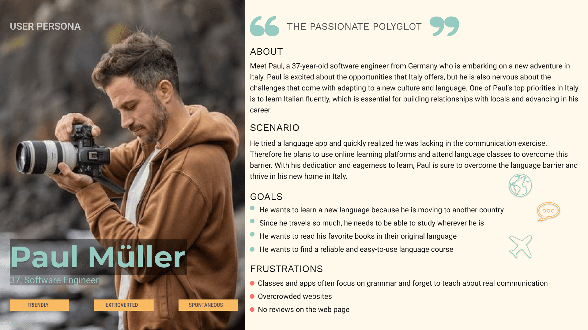
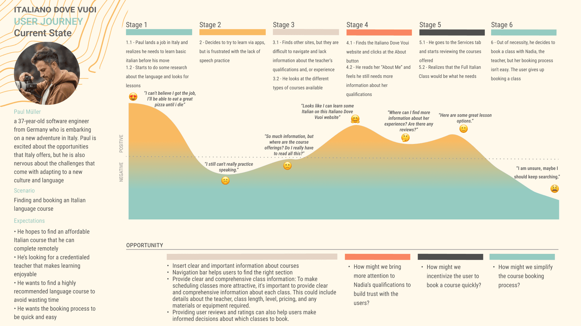
User Persona
Meet Paul, our User Persona. He received a job opportunity in Italy and is looking for an Italian teacher to help him in this new endeavor. He’s a 37-year-old man with no time to waste and not much patience for learning apps. His focus is on conversation to make his life easier in this new job. So Paul starts a search for language courses. He’s not a big fan of apps, so he’s focused on teachers with conversational methods.
Fortunately, Nadja’s website was on his search list. However, Paul was unhappy with the lack of reviews for Nadia’s work, as there is no guarantee that her classes will be helpful. He would also like to have access to an example of your methodology and teaching flow
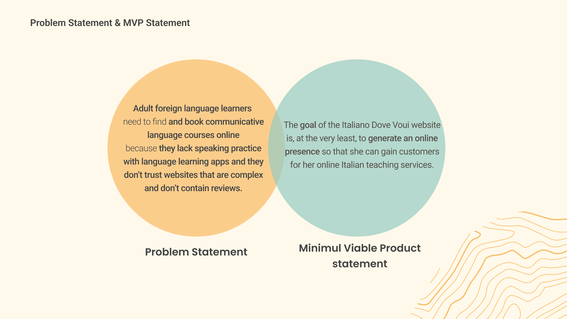
Problem Statement
As our Problem Statement, we worked with:
Adult Foreign language learners need to find and book communicative language courses online because the lack speaking practive with language learning apps and they don’t trust websites that are complex and don’t contain reviews
As our Problem Statement, we worked with:
Adult Foreign language learners need to find and book communicative language courses online because the lack speaking practive with language learning apps and they don’t trust websites that are complex and don’t contain reviews
Ideate:
MoSCoW Matrix
So we come to the MoSCoW method. According to research, a successful language learning website should have several key elements in order to attract and retain students.
Firstly, the website should have a clear and engaging presentation of the teacher. This can be achieved through a bio or profile that provides information about the teacher’s experience and qualifications. This helps establish credibility and trust with potential students and gives them a sense of who will be guiding them through their language learning journey.
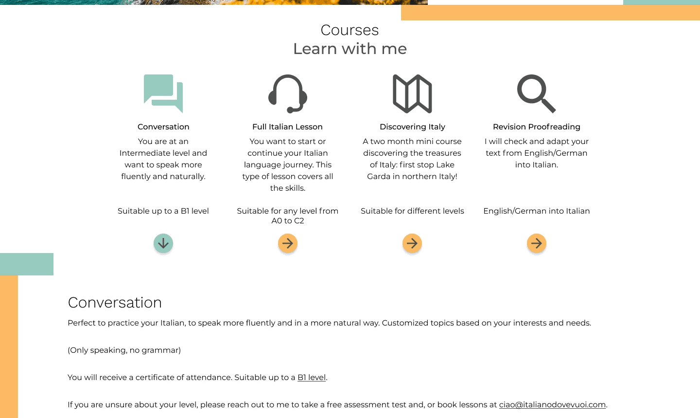
Secondly, the website should provide clear and transparent pricing information for the classes. This helps students make an informed decision about whether they can afford the classes and what they can expect to pay. Providing clear pricing information can also help build trust with potential students and establish the credibility of the website and its teachers.
Thirdly, it is important to provide detailed information about the courses available. This includes descriptions of what students can expect to learn in each course and how the courses are structured. Providing clear course information can help students choose the right course for their needs and ensure that they have a positive learning experience.
Fourthly, it is important to provide information about how the classes will be held. This can include information about whether classes will be held in-person or online, what platform will be used for online classes, and what students can expect from each class. Providing clear information about the logistics of the classes can help students feel more prepared and confident in their learning experience.
Finally, it is important to provide multiple forms of contact for students. This includes email, phone, or chat options, which can be used if students have questions or need assistance. Providing multiple contact options can help students feel supported and connected to the teacher and the language learning community.
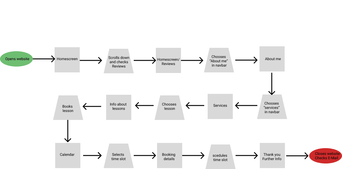
User Flow
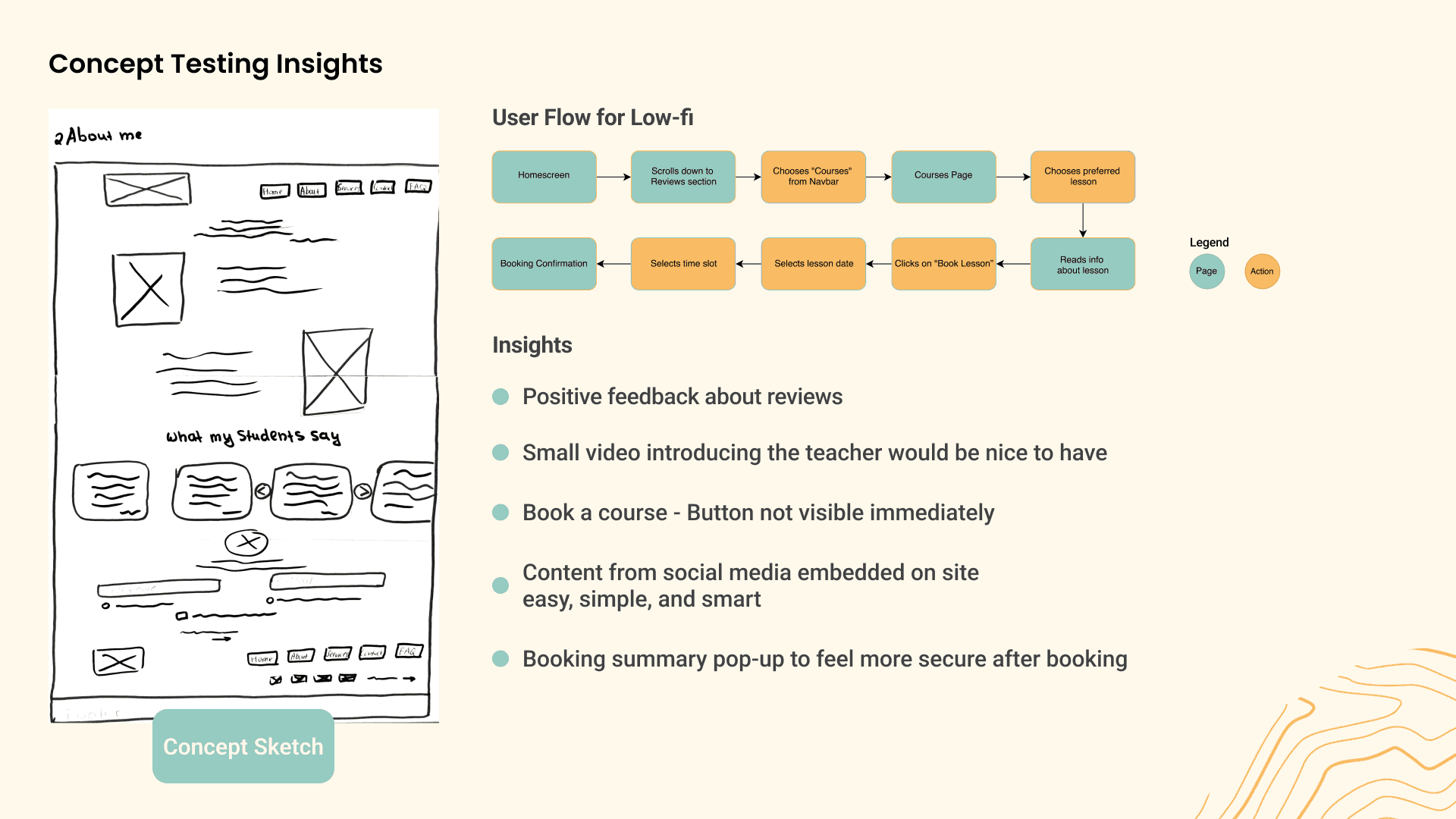
The user flow begins on the homepage, where the user can see an overview of the language learning services offered. The user clicks on the About Me section to learn more about Nadia and her qualifications. After reading Nadia profile, the user navigates to the Services section and chooses a specific service type that they are interested in. Upon selecting a service, the user is directed to a page with more detailed information about that service, including pricing, course duration, and scheduling options. The user decides to book a lesson and is taken to a booking form where they can choose the date and time of the lesson. After filling out the form, the user receives a confirmation message indicating that their lesson has been scheduled successfully.
The user flow begins on the homepage, where the user can see an overview of the language learning services offered. The user clicks on the About Me section to learn more about Nadia and her qualifications. After reading Nadia profile, the user navigates to the Services section and chooses a specific service type that they are interested in. Upon selecting a service, the user is directed to a page with more detailed information about that service, including pricing, course duration, and scheduling options. The user decides to book a lesson and is taken to a booking form where they can choose the date and time of the lesson. After filling out the form, the user receives a confirmation message indicating that their lesson has been scheduled successfully.
Prototype
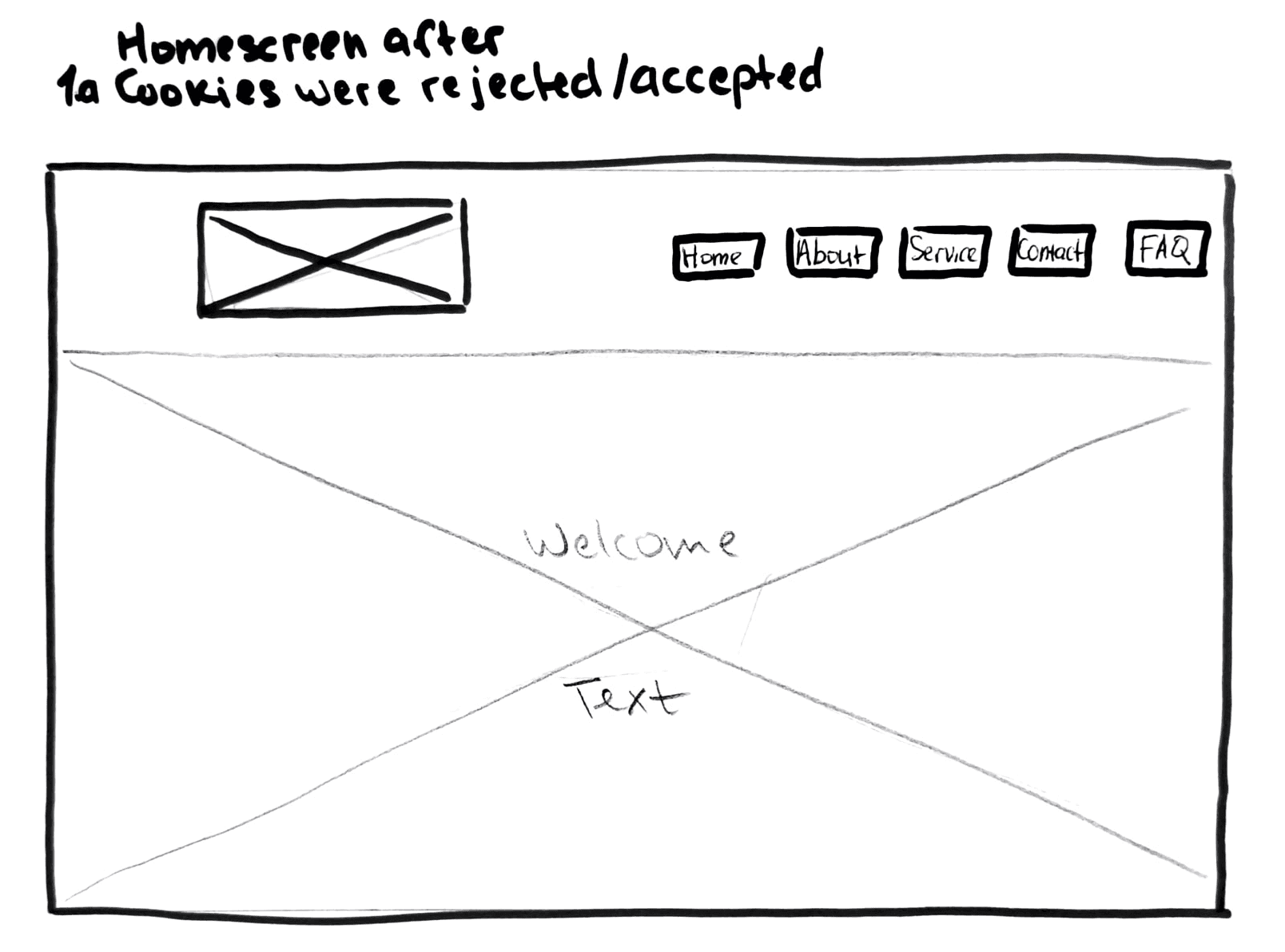
LoFi Wireframe
These are the LoFi we developed. Flow’s focus is on Nadia’s background and scheduling classes. In addition, we focused on presenting Nadia’s qualifications and student reviews.
These are the LoFi we developed. Flow’s focus is on Nadia’s background and scheduling classes. In addition, we focused on presenting Nadia’s qualifications and student reviews.
MidFi Wireframe
For the MidFi we wanted to include a small dropbox to give a more authentic feeling with what was being developed. In addition, it would be easier for the customer to directly choose the type of service that interests him.
For the MidFi we wanted to include a small dropbox to give a more authentic feeling with what was being developed. In addition, it would be easier for the customer to directly choose the type of service that interests him.

Usability Tests
During the usability testing, 5 users were asked to perform various actions on the website and their success rates were recorded. The success rates indicated that the website was generally easy to use and navigate. Users also provided feedback on their impressions of the website. They liked that the content was not overloaded and was clearly sectioned and organized. Additionally, one user suggested adding an arrow in the Services section to indicate that there is more to discover. They also recommended replacing all arrows with buttons. One user disliked the horizontal lines and recommended a scroll to top button. Another user recommended including the course price in the course dropdown. Lastly, users liked the mid-fi design and suggested that social media icons should be bigger and that reviews should be displayed on the homepage. Overall, the feedback from the usability testing was positive and provided valuable insights for improving the website’s design and functionality.
During the usability testing, 5 users were asked to perform various actions on the website and their success rates were recorded. The success rates indicated that the website was generally easy to use and navigate. Users also provided feedback on their impressions of the website. They liked that the content was not overloaded and was clearly sectioned and organized. Additionally, one user suggested adding an arrow in the Services section to indicate that there is more to discover. They also recommended replacing all arrows with buttons. One user disliked the horizontal lines and recommended a scroll to top button. Another user recommended including the course price in the course dropdown. Lastly, users liked the mid-fi design and suggested that social media icons should be bigger and that reviews should be displayed on the homepage. Overall, the feedback from the usability testing was positive and provided valuable insights for improving the website’s design and functionality.
Ui!
Ui!
Competitive Analysis
Upon conducting a competitive analysis of various Italian teacher websites, it was found that the use of the color green and its various shades was a common theme. The color green is often associated with growth and harmony, which could be why it is frequently used on these websites. Additionally, some of these websites employed a high fashion aesthetic in their design, using sleek and modern layouts to attract potential students.
The use of the color green and high fashion aesthetics may be linked to the desire to convey a sense of professionalism and quality. Green is often associated with wealth, health, and prosperity, which could be seen as desirable qualities for a language teacher to possess. Similarly, the high fashion aesthetic exudes a sense of exclusivity and luxury, which could be appealing to potential students who want to learn Italian in a more elevated setting.
In addition to the common use of the color green and high fashion aesthetics, it was also found that two of the Italian teacher websites had a more casual and relaxed vibe. This could be attributed to the fact that these teachers may be targeting a younger or more informal audience who are interested in learning Italian in a less traditional setting. While some may prefer a high fashion and exclusive feel, others may prefer a more casual and laid-back approach.
However, it is important for these websites to also provide clear and concise information about their teaching methods and course offerings to ensure that potential students can make informed decisions about their language learning journey.
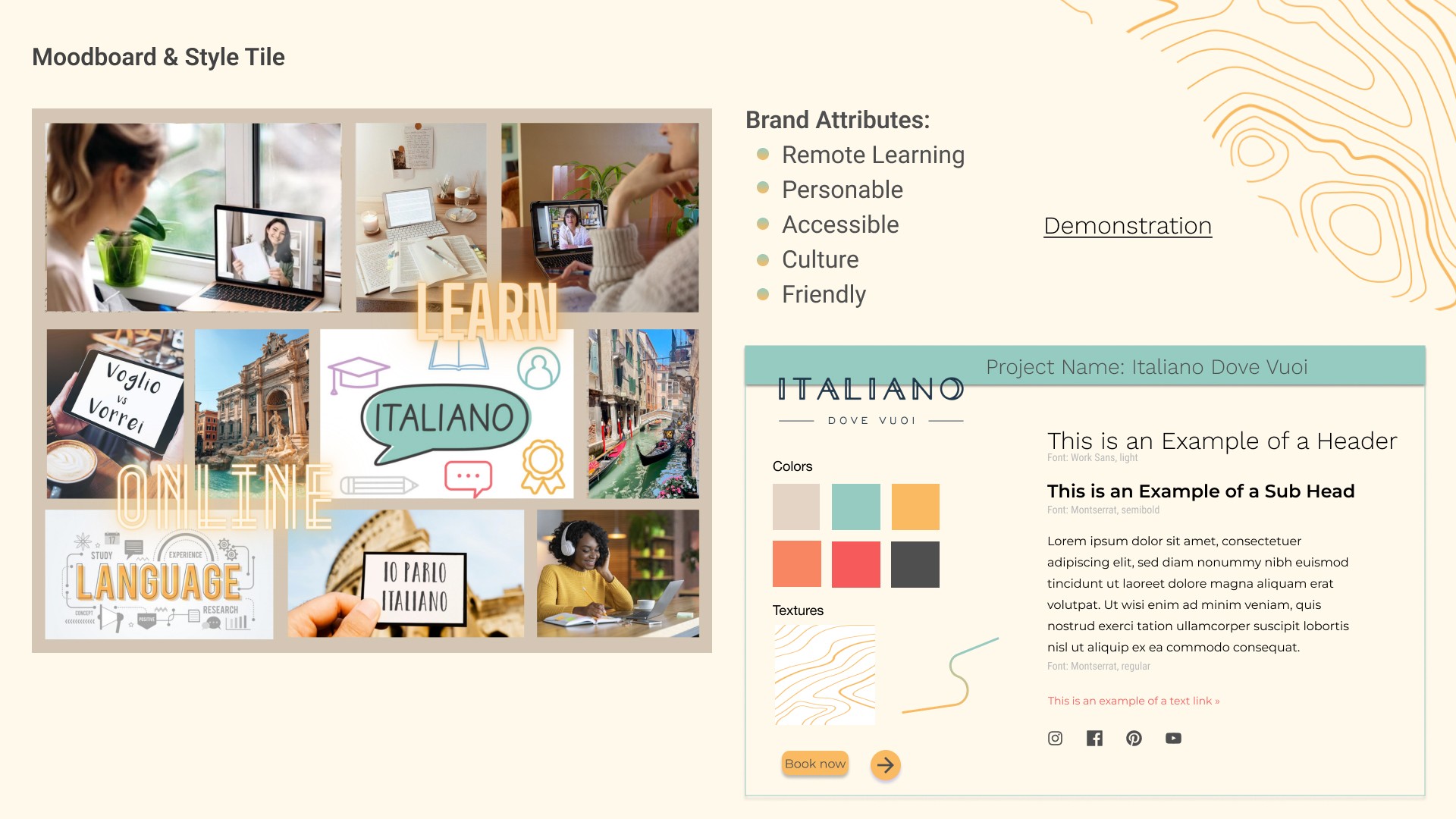
Moodboard & Style Tile
Our moodboard for the online Italian course was designed to capture the essence of our brand attributes, which are remote learning, personable, accessible, culture, and friendly. We wanted the moodboard to evoke a sense of warmth and familiarity while also emphasizing the accessibility and convenience of learning Italian online. The images we chose were a mix of cozy home settings, Italian cultural icons, and approachable teachers, all of which are intended to create a welcoming and comfortable learning environment for our students.
Our moodboard for the online Italian course was designed to capture the essence of our brand attributes, which are remote learning, personable, accessible, culture, and friendly. We wanted the moodboard to evoke a sense of warmth and familiarity while also emphasizing the accessibility and convenience of learning Italian online. The images we chose were a mix of cozy home settings, Italian cultural icons, and approachable teachers, all of which are intended to create a welcoming and comfortable learning environment for our students.
Our moodboard for the online Italian course was designed to capture the essence of our brand attributes, which are remote learning, personable, accessible, culture, and friendly. We wanted the moodboard to evoke a sense of warmth and familiarity while also emphasizing the accessibility and convenience of learning Italian online. The images we chose were a mix of cozy home settings, Italian cultural icons, and approachable teachers, all of which are intended to create a welcoming and comfortable learning environment for our students.
In terms of color selection, we chose a primarily white color palette (#FFFFFF) to convey a sense of simplicity and clarity, which is important for an online learning platform. The secondary colors we selected, #F9BA62 and #95CBC1, were chosen for their warm and inviting tones. The orange tone of #F9BA62 adds a touch of playfulness and energy, while the blue-green tone of #95CBC1 conveys a sense of calm and serenity. Together, these colors create a harmonious and approachable color palette that aligns with our brand attributes and captures the essence of our online Italian course.
In addition to the primary and secondary colors, we also incorporated the use of salmon tones (#F98662) for text links, which adds a pop of color and draws attention to important information on the website. This color also adds to the overall warmth and friendliness of the site.
For the body text on the site, we chose a dark gray color (#4F4F4F) to ensure that the text is easily legible and provides contrast against the white background. This color choice also creates a sophisticated and professional look, while still maintaining a personable and approachable vibe. Overall, our color choices were carefully selected to create a cohesive and inviting visual experience for our students, while also emphasizing the important information and content on the site.
The choice of fonts is also an important aspect of the design. We selected Work Sans for the headlines and Montserrat for the body text. Work Sans is a modern and clean sans-serif font that is easy to read and complements the overall aesthetic of the site. Its slightly rounded edges also add a friendly and approachable touch.
On the other hand, Montserrat is a classic and versatile font that is easy to read even at small sizes. It adds a sense of sophistication and professionalism to the site, while still maintaining a friendly and accessible tone. Together, these fonts create a cohesive and visually appealing typography that adds to the overall user experience of the online Italian course.
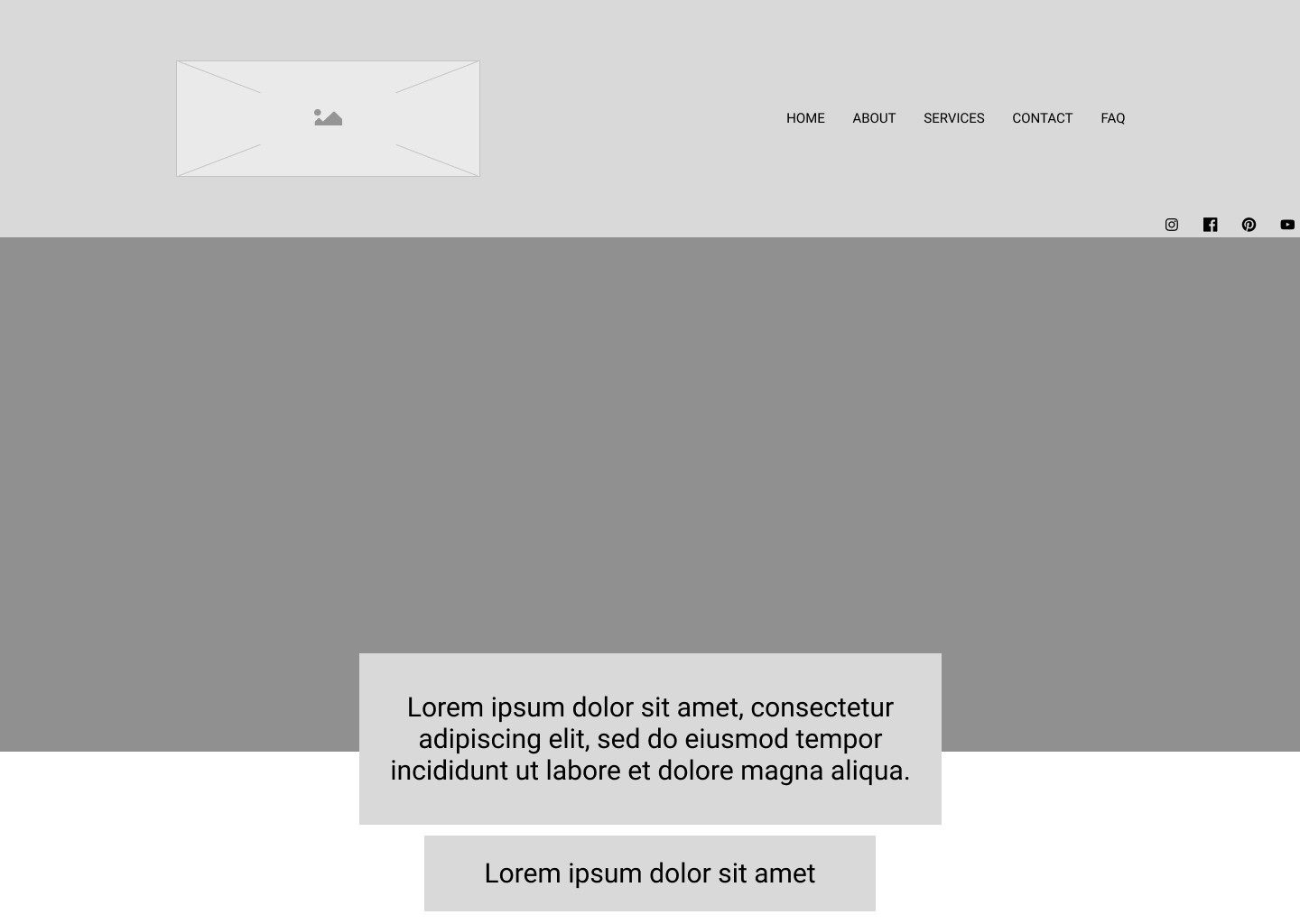
HiFi Wireframes
HiFi Wireframes
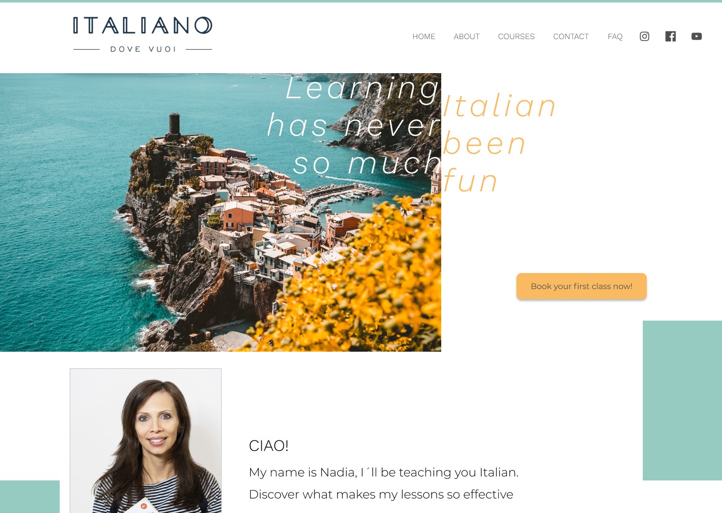
When developing the HiFi for the online Italiano Dove Voui, our main goal was to create a visual aesthetic that conveyed a sense of lightness, professionalism, and trustworthiness. To achieve this, we focused on using a clean and minimalist design approach. We also paid careful attention to the use of white space, ensuring that the layout was easy to navigate and didn’t feel cluttered or overwhelming.
In addition to the aforementioned design elements, we also incorporated geometric shapes, specifically rectangles, to guide the user’s eye through the website. By using these shapes strategically, we were able to create a clear visual hierarchy that directs the user’s attention to the most important information on the page, such as the course offerings and the call-to-action buttons.

Furthermore, the use of geometric shapes also adds a sense of structure and organization to the design, which helps to reinforce the website’s professional and trustworthy image. By combining these various design elements and principles, we were able to create a HiFi design that not only looks visually appealing, but also functions effectively in guiding the user through the site and encouraging them to take action.
Furthermore, the use of geometric shapes also adds a sense of structure and organization to the design, which helps to reinforce the website’s professional and trustworthy image. By combining these various design elements and principles, we were able to create a HiFi design that not only looks visually appealing, but also functions effectively in guiding the user through the site and encouraging them to take action.

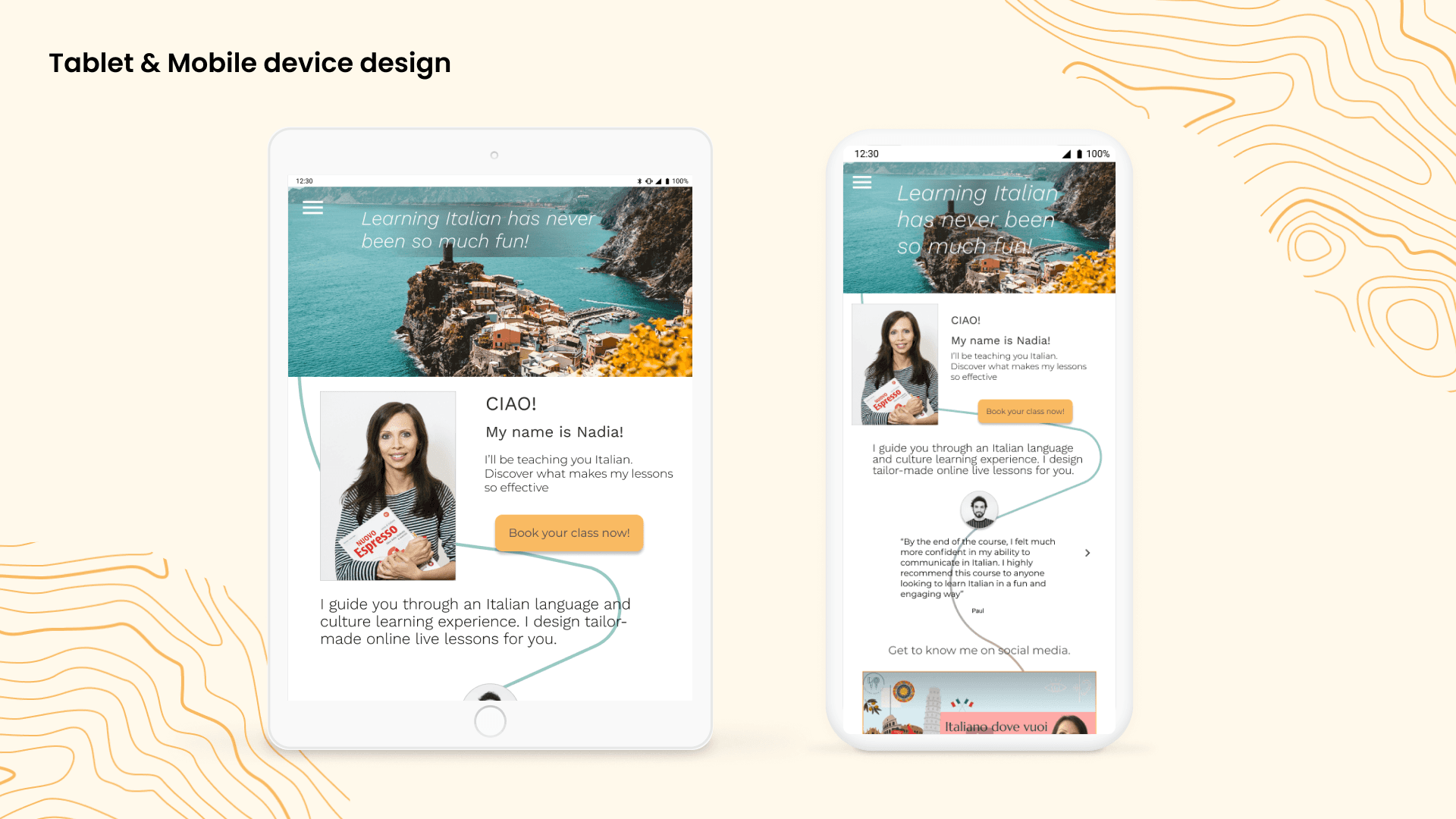
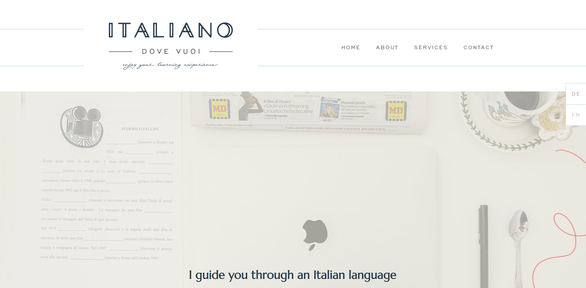
Responsive Design
For the responsive design, we made some changes to the use of geometric shapes on the website. Instead of using rectangles, we opted to use a single line to guide the user’s eye through the site. This line, which is designed to adapt to different screen sizes, is created using a gradient effect that incorporates both of the secondary colors we chose for the site.By using a line instead of rectangles, we were able to create a design that is more flexible and responsive to different screen sizes and device types. The use of the gradient effect also adds a dynamic and visually interesting element to the design, while still maintaining the overall brand aesthetic of the site. Overall, our approach to the responsive design focused on creating a design that is not only functional and user-friendly, but also visually appealing and consistent with the brand attributes of Remote Learning, Personable, Accessible, Culture and Friendly.
For the responsive design, we made some changes to the use of geometric shapes on the website. Instead of using rectangles, we opted to use a single line to guide the user’s eye through the site. This line, which is designed to adapt to different screen sizes, is created using a gradient effect that incorporates both of the secondary colors we chose for the site.By using a line instead of rectangles, we were able to create a design that is more flexible and responsive to different screen sizes and device types. The use of the gradient effect also adds a dynamic and visually interesting element to the design, while still maintaining the overall brand aesthetic of the site. Overall, our approach to the responsive design focused on creating a design that is not only functional and user-friendly, but also visually appealing and consistent with the brand attributes of Remote Learning, Personable, Accessible, Culture and Friendly.
Key Learnings:
Managing time and the use of white space were definitely key learnings from this project. In terms of time management, it was important to set clear deadlines and priorities for each stage of the project, allowing us to work more efficiently and effectively. As for white space, it was a powerful tool in creating a clean and minimalist design that conveyed a sense of professionalism and sophistication. It also helped to guide the user’s attention to the most important elements on the page, creating a more seamless user experience. Overall, these learnings were valuable not just for this project, but for future projects as well.
Thanks for reading this far! I hope it was enlightening and enjoyable.
All rights reserved © Vinicius Scoralick 2023.
All rights reserved © Vinicius Scoralick 2023.
All rights reserved © Vinicius Scoralick 2023.