Arthur is a Tuk Tuk driver in Lisbon—a charismatic and engaging individual with a striking personality. His visual identity radiates lightness and fun.
Graphic Design
Hospitality
The Project
Analysis of the Previous Card
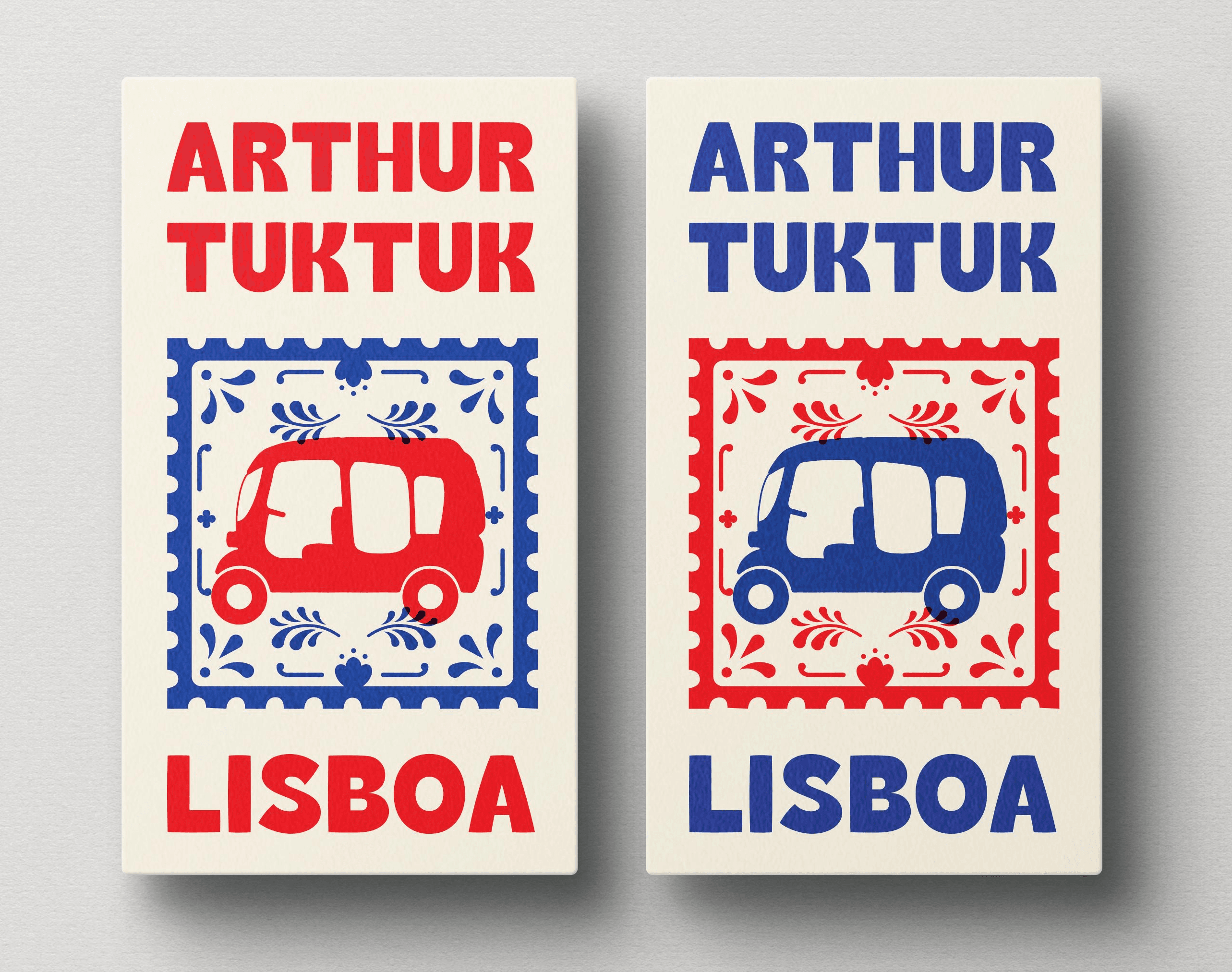
Arthur’s old business card was functional and culturally rooted, with a design that celebrated Lisbon’s visual heritage. The use of traditional azulejo-inspired patterns gave it a sense of place and authenticity, making it instantly recognizable as part of Lisbon’s aesthetic identity.
However, while this approach effectively highlighted the Tuk Tuk service and its connection to the city, it lacked personalization and character. The design was too focused on the vehicle and cultural motifs, failing to reflect Arthur’s vibrant personality, theatrical background, and the unique experience he offers to clients.
The back of the card, featuring a QR code and a continuation of the azulejo aesthetic, reinforced this visual style but also contributed to a somewhat static and conventional tone, which didn’t align with Arthur’s dynamic and playful nature.

Design Solutions
Sketch & Research


Hi-Fi & Final Testings


Next Steps:
Following the success of the first design, Arthur expressed interest in exploring a square-shaped business card as a secondary option. This variation would not only stand out due to its unconventional format but also reinforce the sense of uniqueness that reflects Arthur’s personality and brand identity.
The groovy theme will remain a central element, but I plan to approach it with fresh design experiments — such as bolder patterns, layered textures, and playful typographic treatments — to ensure the square card feels like a collectible piece rather than just a functional item.
One exciting idea is to transform the design into a hybrid card-sticker format, allowing Arthur to leave his mark around the city. This would give him a more informal and engaging way to promote his Tuk Tuk tours, turning the card into a visual signature that tourists and locals alike can interact with — whether by collecting, keeping, or even sticking it somewhere visible.
The square variation will also open up possibilities for new layout experiments for the QR code and contact information, ensuring that the back of the card remains clean and functional while maintaining the bold personality that defines Arthur.
Final details
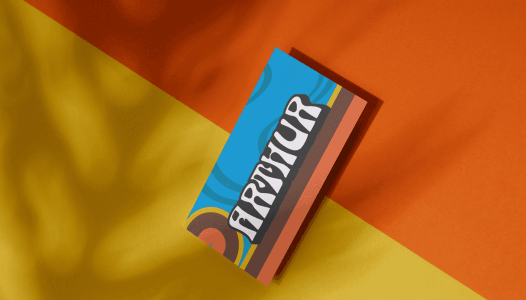
The redesign of Arthur’s business card marks a shift from a conventional, tourism-focused identity to a personalized brand that fully embodies who Arthur is. While the previous design leaned heavily on Portuguese symbols like azulejos and a traditional aesthetic, it didn’t reflect Arthur’s vibrant energy, charisma, and performative nature.
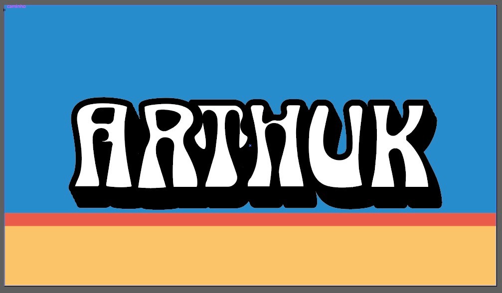
The new design embraces a groovy 70s aesthetic, echoing Arthur’s own style of clothing and upbeat personality. Through warm tones inspired by Lisbon’s sun-soaked architecture and cool blue textures that reference the breeze of Tuk Tuk rides, the card creates an immediate emotional connection while standing out from the typical, tourist-driven visuals.
By combining bold typography, retro-inspired color blocking, and a dynamic layout, the new card not only highlights Arthur’s individuality but also positions him as more than just a Tuk Tuk driver—it conveys the idea of a unique and memorable experience, guided by someone with authentic character and charm.
This transformation is not just a visual update; it’s the creation of a strong personal brand, one that resonates with both tourists and locals, leaving a lasting impression long after the ride is over.