Antiga Wine Bar
Antiga Wine Bar
Antiga Wine Bar is a charming and intimate space nestled in the heart of Lisbon’s historic district. The space offers a warm, intimate setting that highlights a carefully selected range of Portuguese wines. The owners approached me with the goal of redesigning their menu, as the existing layout neither supported staff efficiency nor offered a clear and intuitive experience for customers.
SERVICES
SERVICES
Graphic Design
UX Design
INDUSTRY
INDUSTRY
Restaurant
Restaurant
The Project
The Project
When the owners reached out, their main request was to transform the menu into something more user-friendly, without losing the informal and playful tone that defines the personality of Antiga Wine Bar.
To better understand the challenges, I gathered insights from the staff. They shared that guests frequently asked about allergens, as this information wasn’t clearly presented. I also noticed the wine list lacked visual cues to distinguish between types—reds, whites, rosés—despite being written only in Portuguese. When I asked if this caused confusion, the team confirmed that they often had to guide customers through the wine options manually.
These insights revealed two key priorities: improving operational efficiency for the staff and making the menu more intuitive and accessible for customers. With that in mind, I began designing a solution that would enhance both clarity and usability—while preserving the lighthearted, inviting atmosphere of the space.
Another key issue was the use of visual labels to highlight certain categories—such as Specials and Desserts. While intended to guide the reader, these tags inadvertently drew attention away from the “Specials” section, which the client had identified as a priority for sales.
Despite its strategic placement, the visual emphasis created by the dessert label overpowered the Specials, leading to a misalignment between visual hierarchy and business goals.
Design Solutions
1. Typography and Color Standardization
A clear typographic system was established, with a well-defined hierarchy for headings, descriptions, and prices. All fonts were unified based on the existing brand identity, and the color palette was adjusted to ensure legibility and consistency across both the food menu and wine list.
2. Visual Reorganization and Information Hierarchy
Menu categories were redesigned to guide the customer’s eye intuitively, giving visual priority to the "Specials" section, as requested by the client. Previously used labels for desserts and small plates were restyled with a more subtle approach, ensuring they didn’t compete with key commercial elements.
3. Allergen Signage and Accessibility
A simple and intuitive icon system was introduced to indicate the presence of gluten, dairy, nuts, and vegan options. This adjustment aimed to reduce customer inquiries while speeding up service and making the menu more accessible to a wider audience.
4. Wine List with Improved Navigation
The wine list was reorganized using labels and color codes to clearly distinguish between red, white, rosé, and sparkling wines.
Sketch, Research and Mid's
I began with a quick draft for the food menu, using the existing wine list layout as a structural foundation. Its framework offered a strong starting point—already functional and familiar to the staff—requiring only a few strategic adjustments to enhance usability for meal service.
My initial concept preserved the overall layout, especially the price placement. I designed a unified price column aligned to the right, forming a clean vertical guide that makes pricing easy to scan at a glance. This helped create visual rhythm and improved user navigation, particularly for returning customers and staff during service.
However, after conducting a visual audit of menus from top wine bars in cities like Paris, Madrid, and Lisbon, I noticed a recurring pattern: prices were often placed in close horizontal proximity to the dish or wine name, rather than aligned vertically in a separate column.
This approach created a more natural reading flow, where the value of each item was directly associated with its description—enhancing clarity and reducing visual scanning effort. Based on these findings, I chose to shift the visual logic of the menu accordingly.
This change also prompted a reconsideration of the allergen icon placement, which had initially been positioned farther from the dish names. The new layout allowed for icons to sit closer to each item, improving accessibility without disrupting the overall visual balance.
I began with a quick draft for the food menu, using the existing wine list layout as a structural foundation. Its framework offered a strong starting point—already functional and familiar to the staff—requiring only a few strategic adjustments to enhance usability for meal service.
My initial concept preserved the overall layout, especially the price placement. I designed a unified price column aligned to the right, forming a clean vertical guide that makes pricing easy to scan at a glance. This helped create visual rhythm and improved user navigation, particularly for returning customers and staff during service.
However, after conducting a visual audit of menus from top wine bars in cities like Paris, Madrid, and Lisbon, I noticed a recurring pattern: prices were often placed in close horizontal proximity to the dish or wine name, rather than aligned vertically in a separate column.
This approach created a more natural reading flow, where the value of each item was directly associated with its description—enhancing clarity and reducing visual scanning effort. Based on these findings, I chose to shift the visual logic of the menu accordingly.
This change also prompted a reconsideration of the allergen icon placement, which had initially been positioned farther from the dish names. The new layout allowed for icons to sit closer to each item, improving accessibility without disrupting the overall visual balance
I began with a quick draft for the food menu, using the existing wine list layout as a structural foundation. Its framework offered a strong starting point—already functional and familiar to the staff—requiring only a few strategic adjustments to enhance usability for meal service.
My initial concept preserved the overall layout, especially the price placement. I designed a unified price column aligned to the right, forming a clean vertical guide that makes pricing easy to scan at a glance. This helped create visual rhythm and improved user navigation, particularly for returning customers and staff during service.
However, after conducting a visual audit of menus from top wine bars in cities like Paris, Madrid, and Lisbon, I noticed a recurring pattern: prices were often placed in close horizontal proximity to the dish or wine name, rather than aligned vertically in a separate column.
This approach created a more natural reading flow, where the value of each item was directly associated with its description—enhancing clarity and reducing visual scanning effort. Based on these findings, I chose to shift the visual logic of the menu accordingly.
This change also prompted a reconsideration of the allergen icon placement, which had initially been positioned farther from the dish names. The new layout allowed for icons to sit closer to each item, improving accessibility without disrupting the overall visual balance.


With this new direction in mind, I moved forward with a mid-fidelity layout to test the feasibility of the idea.
This iteration revealed a more effective use of white space, allowing the content to breathe while improving overall readability. The revised structure also opened space to reintegrate select visual elements from the previous menu—small details that carried brand personality and familiarity for returning customers. These elements helped preserve the casual, approachable tone of Antiga Wine Bar while aligning the design with a more thoughtful and user-centered structure.
From there, I began experimenting with different typefaces for the headings, exploring which options best supported both legibility and brand character.
I ultimately decided to retain one of the original heading fonts—Ink Free—and apply it consistently across all headings that were not part of a label or tag. This choice preserved a sense of continuity with the original menu and maintained the informal, handwritten tone that reflects the wine bar’s relaxed personality.
For the body text, however, I chose to replace Ink Free, which had previously been used in dish descriptions. While visually charming, it significantly hindered readability. I introduced Courier New as the body typeface, which offered greater clarity, a strong contrast to the headings, and a subtle nod to informality through its monospaced structure.
These adjustments directly supported the original design goal: to bring typographic consistency and functional clarity to the menu, without sacrificing personality.
Hi-Fi:
With the layout structure firmly established, aesthetic decisions unfolded more naturally.
To validate these design choices, I conducted a series of usability tests with potential customers, focusing specifically on the visibility and comprehension of the allergen icons.
Among the different positioning options tested, placing the icons to the left of the dish name consistently received the highest approval. Participants reported that this placement felt natural and easy to spot, allowing them to process essential dietary information quickly, without disrupting their reading flow.
This confirmed that the left-aligned icons not only met accessibility goals but also enhanced the overall user experience—especially for customers with dietary restrictions.
To reinforce the section’s cohesion, the icons were placed within the elliptical shapes used in the headings, visually tying them to the surrounding typographic structure and strengthening the sense of belonging within each category block.
Prices remained aligned to the right, using the same typeface as the body text for visual continuity. I assigned them a deep garnet tone, a warm accent color drawn from Antiga Wine Bar’s brand palette. This color choice not only aligned with the brand's identity but also increased visibility and emphasis on pricing without being disruptive.
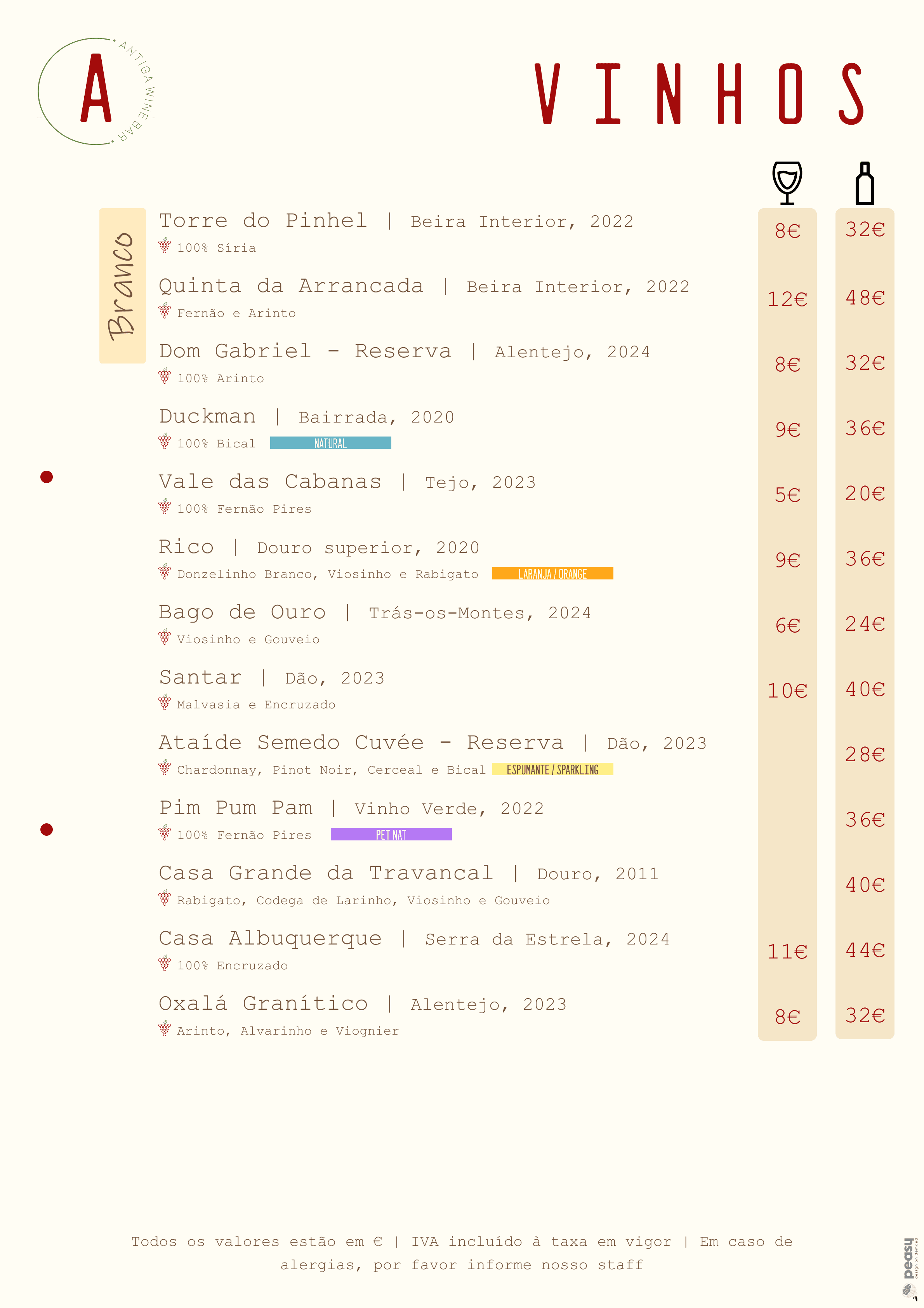
For the wine menu, the overall structure remained consistent with the original layout.
However, I introduced a color-coded labeling system to make navigation and understanding easier for customers. Each wine type was assigned a distinct label color:
Red wines – Deep red tone
Rosé wines – Soft pink
White wines – Warm beige
Green wines – Fresh green
Port wines – Rich burgundy
Soft drinks – A calm blue, chosen to intuitively reference water and freshness
Within these categories, I created additional sub-labels to highlight special wine types: Natural Wines, Orange Wines, Sparkling Wines, and Pet Nat. Each of these received its own color identity:
Natural Wines – Aqua green, evoking purity and organic qualities
Orange Wines – Orange, for its obvious and direct association
Sparkling Wines – A muted yellow, ensuring readability and comfortable contrast with typography
Pet Nat – A soft lilac, adding a sense of lightness and youthful energy
This system not only streamlined the user’s visual scanning process but also reinforced the playful and approachable personality of Antiga Wine Bar’s brand identity.
The wine regions and vintage year were presented in a slightly smaller font size, placed right beside each wine name. This hierarchy ensured that the most important information—the wine name—remained in focus, while additional details were easy to find without cluttering the layout.
Finally, I redesigned the grape icon, giving it a more modern and minimal aesthetic that better aligns with the updated visual identity. The grape varieties for each wine were kept in the same font as the wine names, reinforcing a sense of consistency and visual balance throughout the menu.
I also created a panel-format version of the menu, designed to be displayed at the entrance of the wine bar.
I developed a unified version that combines both pages of the food menu. This approach ensures that all essential information is clearly visible to customers upfront, helping them make informed decisions even before entering the venue.
Final details
To conclude the project, I ensured that spacing between items—both in the food menu and the wine list—was precisely defined, addressing one of the major usability issues in the original layout.
For the wine menu columns, I increased the spacing to allow for larger, more legible pricing, while maintaining consistency in typeface and color across all sections.
I also added guidelines for staff, indicating where to place the hole punch for binding, ensuring better organization within the menu folders.
Lastly, I recommended the use of a thicker, textured paper stock to elevate the tactile and visual quality of the menu, reinforcing Antiga Wine Bar’s refined yet approachable aesthetic.
Next Steps:
There have been initial discussions about updating the restaurant’s business cards, wine glass coasters, and other branded details.
However, these projects are currently on hold due to ongoing conversations about a complete rebranding of the establishment, which is planned to coincide with the upcoming renovation period.
By the end of the year, a new project focused on this rebranding will be added to this portfolio.
All rights reserved © Vinicius Scoralick 2023.
All rights reserved © Vinicius Scoralick 2023.
All rights reserved © Vinicius Scoralick 2023.